This project was a one-off contract with the wonderful guys at Razeware LLC, USA (Raywenderlich.com). I was tasked with redesigning the onboarding experience of Raywenderlich.com to ensure customer acquisition and retention.
About Razeware
"Razeware LLC (Raywenderlich.com) is a community site focused on creating high-quality programming tutorials.
We pride ourselves on creating the highest-quality video courses, books, and written tutorials on the Internet.
Every tutorial on our site goes through three rounds of editing before publication, to make sure each tutorial works 100%, is technically accurate, and provides comprehensive coverage of the topic..."
Task Brief
There have been recorded user drop-offs during onboarding due to the current UI and UX of the onboarding process. There’s a need to redesign our onboarding process at raywenderlich.com to retain more users. Given this problem, propose and design a new onboarding experience for raywenderlich.com users.
This project should be approached in 3 steps:
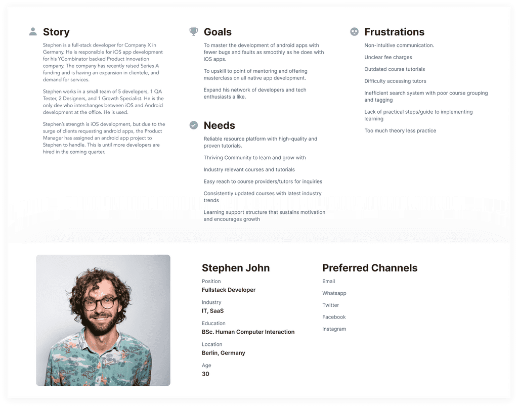
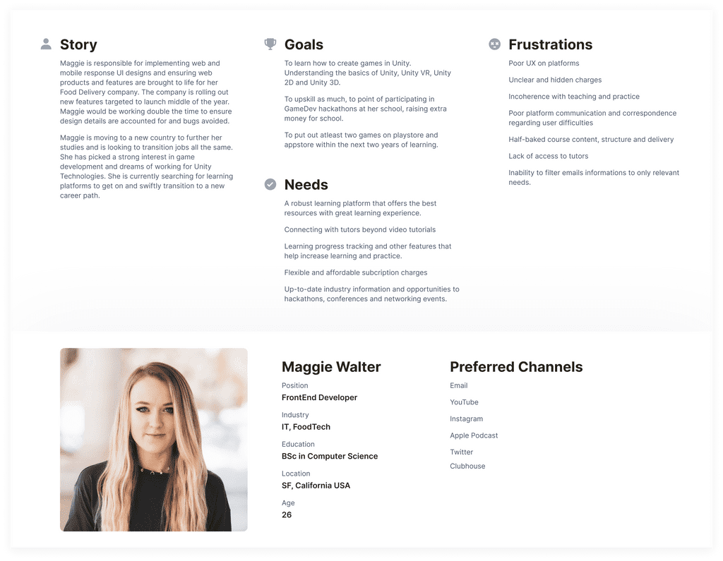
Step 1: Hypothesis on the type of users that create an account (Up to 2 personas)
Create fictional personas to build the onboarding around
Step 2: Lo-fidelity wireframe of your proposed onboarding process
Create the steps in low-fidelity that the personas will take through the proposed onboarding process and annotate your thinking at each stage
Step 3: Hi-fidelity final design of the proposed onboarding
Add polish, color, and imagery to your onboarding process.
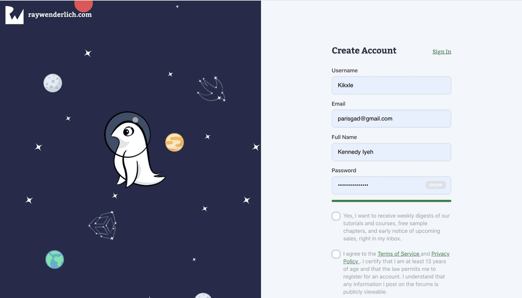
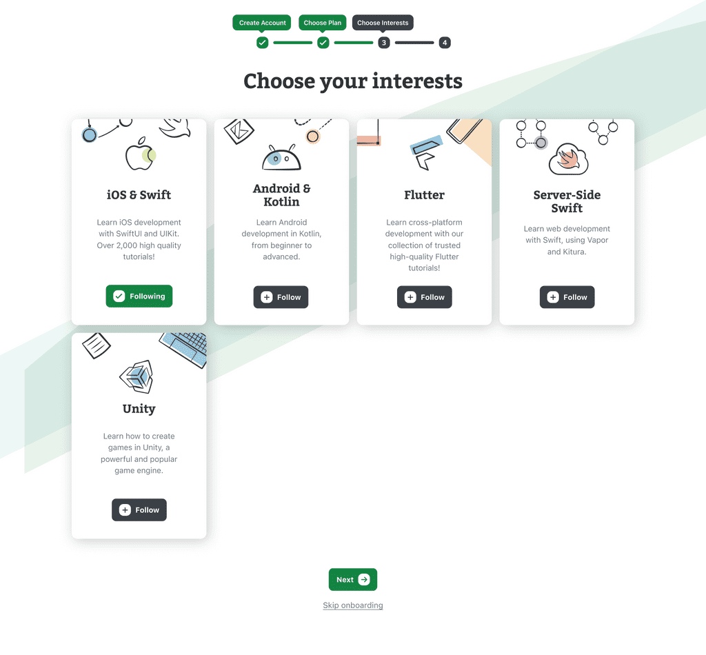
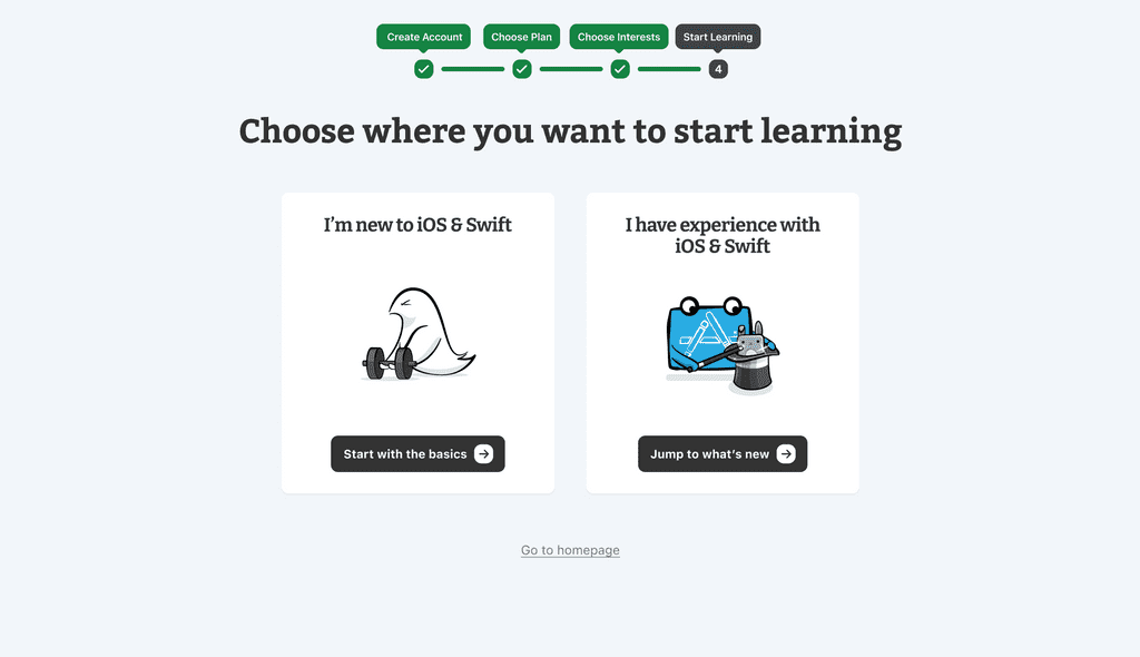
Current Look

The Redesign
User personas
Low-Fidelity & Design Rationale
1. Pricing Page
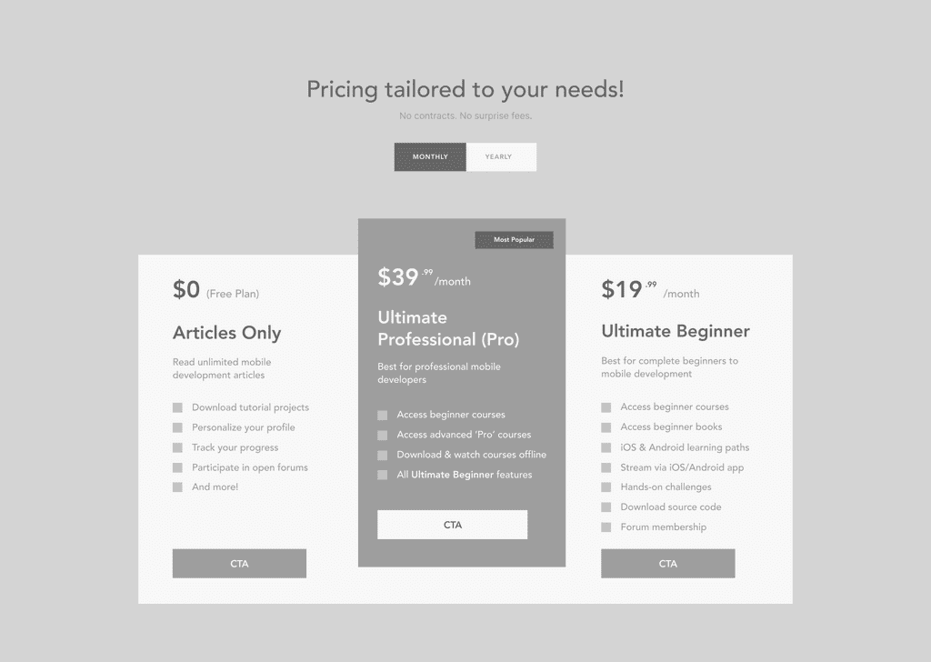
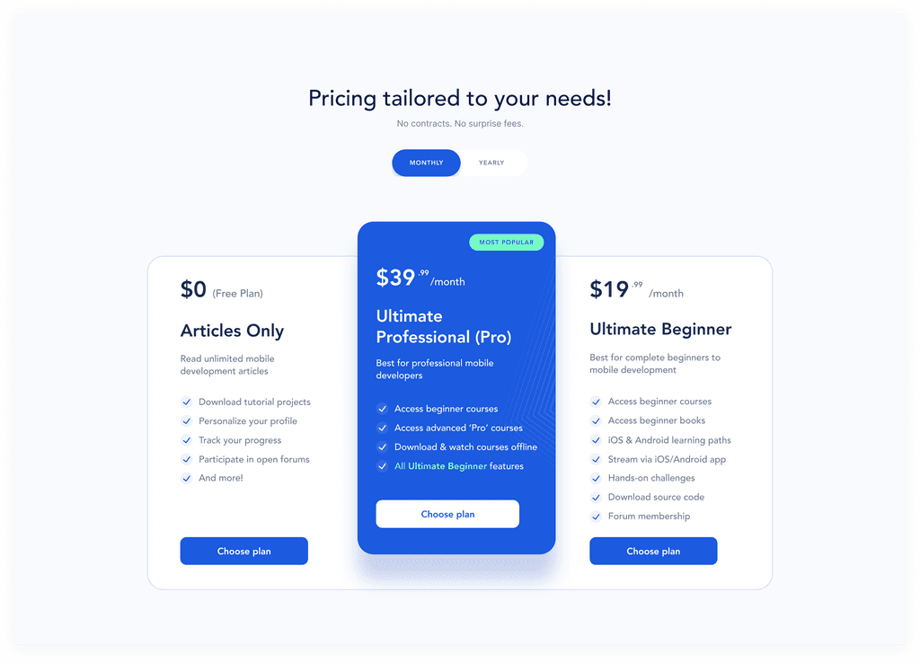
I worked on the pricing page and gave it a facelift, redesigned the interface, and used different color shades (as approved by Razeware). Asides from the visual design, I worked on the UX and addressed particularly two things:
-
Proper Breakdown, Less Thinking
The current pricing page doesn’t separate monthly pricing from yearly pricing and this can be confusing for users. As negligible as it might seem, it poses a user challenge which is making them think much to understand exactly how the math “maths”.
It’d be great to allow users to see how the monthly differs from the yearly. A good UX doesn’t make users think too much. In the book ‘Don’t Make Me Think’ by Steve Krug, he details the psychology of users and how they repel whatever isn’t clear to them.
-
Less Reading, More Clean Spaces
The focal pricing plan ‘Ultimate Professional (Pro)’ is quite lengthy and takes up good space and makes users read so much, as they have to read between the 3 pricing options, compare and decide on which to choose.
Upon review, I observed that the Ultimate Professional is the same as the Ultimate Beginner but with 3 added features. So I thought it wise that on the Pro plan, we highlight the 3 added features, then caption the 4th option on the list as the Ultimate Beginner. That way a user doesn't have to read too much from card to card. Once they understand the Ultimate Beginner plan, they know Ultimate Professional is all these but with these new features. This makes assimilation, comparison, and decision-making easy.
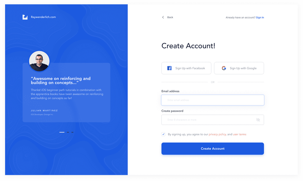
2. Create Account
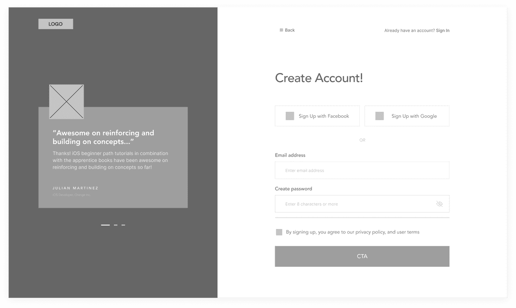
Improved Visual design was given to this page. To make it more exciting and less bulky.
-
Continuous Marketing
Most times users either unintentionally landed on the sign-up page or they are likely to discontinue their sign-up process. Whichever it is, it is necessary to never stop sustaining and fueling their interests from page to page, it helps with onboarding and retention.
In this improvement, I used the card on the left to talk more about Razeware. This time, from a more human interaction aspect by displaying reviews with images to drive new prospective users to complete their sign up. This is important because while landing pages are good, not all users read the whole content. But the sign-up page is a non-scrolling page that fixates the info to the user.
-
Considering Edge Cases
While designing it’s important to consider edge cases. In this case, the edge case is the users who do not like creating an account from scratch because they’ve done this over and over again on different platforms and are already exhausted, so they usually opt for faster and easier options.
The faster and easier options are the use of Google and Facebook, which the majority have accounts with. So allowing users to choose how they wish to sign up is a worthwhile option to accommodate every Tom, Dick, and Harry.
-
More Clean Spaces
In the current Raywenderlich site, on the sign-up page, there are long pieces of information with checkboxes for users. The first one is about receiving weekly digest and information, this is something most new users do not entertain so there might be no need to ask them before they sign up. It would rather be better to ask them that upon email verification and confirmation. Then they are much more in and settled. As for the 2nd one regarding terms of use, I had to shorten it with links to where they can read in full.
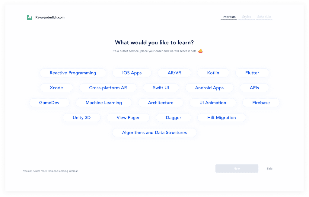
3. Learning Interests
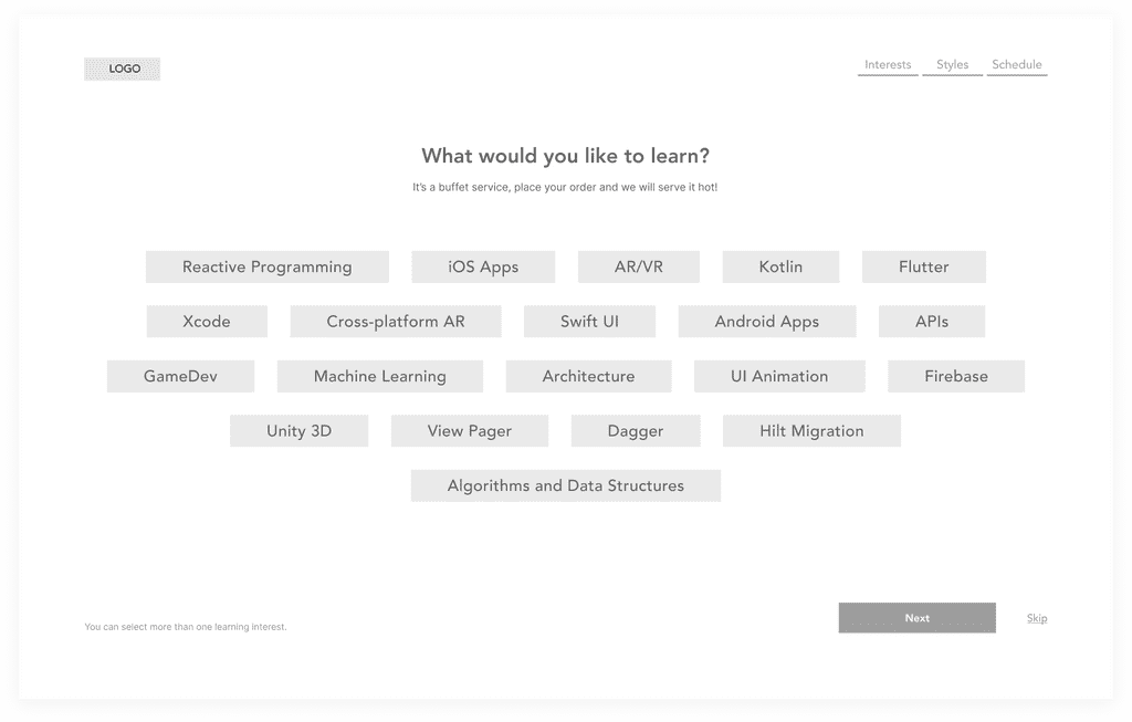
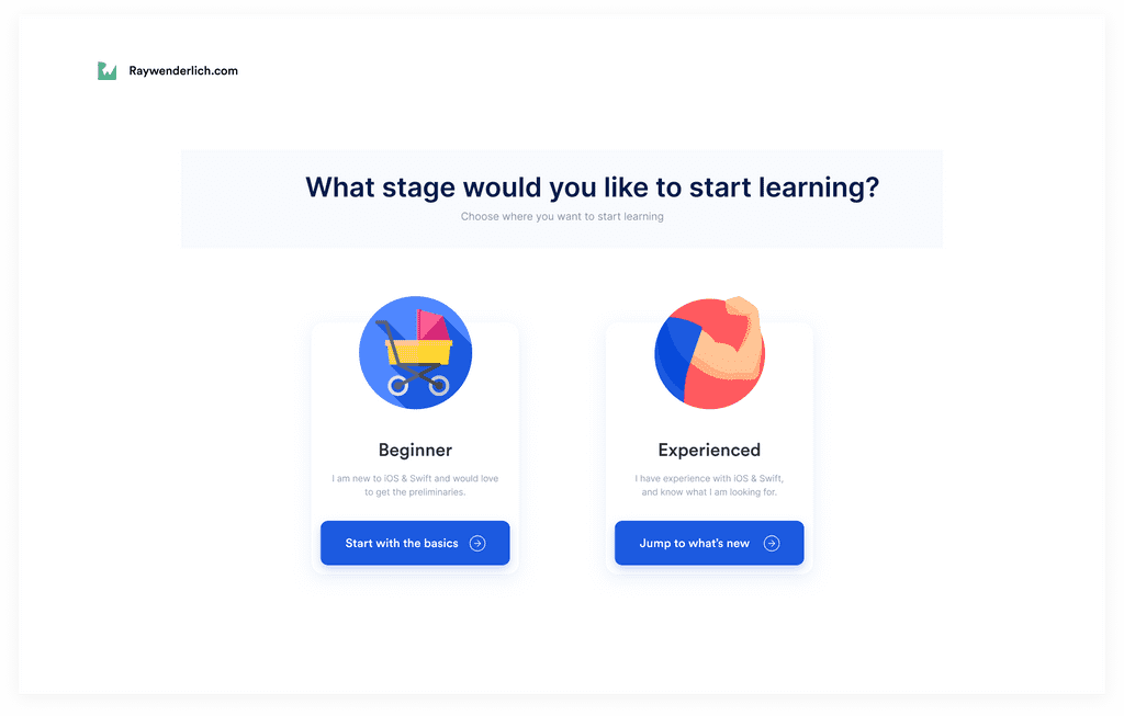
This page was created with the intention to learn users' interests. What existed initially showed 5 category displays which can be pretty bulky and complex for a beginner and doesn't capture their learning interests very well. So it is quite wise to break it down into bits so users can find it easier and simpler to pick their interests. These interests will be used to populate their dashboard with the right resources they need to feel welcomed and satisfied to begin their learning. It is also useful for making recommendations, discount promos, etc.
Also, this page opens with great UX Copy that has an upbeat and quirky voice to ease in a user and allow them to engage with the onboarding, while sustaining their interests till they get to the dashboard.
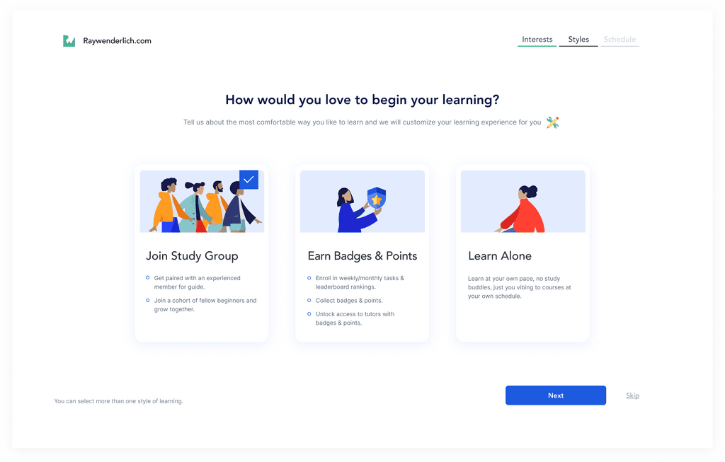
4. Learning Style
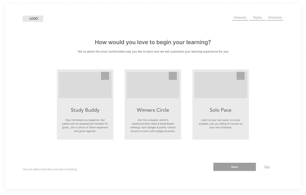
This page focuses on understanding what style or structure works well for their learning. It is aimed at providing a solution to learner’s blocks and to sustain their motivation. This page attacks motivation through 2 approaches while allowing users a 3rd approach which is them having independence over their learning.
-
Support Structure
The goal is to sustain the motivation of users and to also help fulfill some of the goals on the User Personas created. This style pairs a volunteer member who has grown on the platform and has volunteered to help answer questions and guide beginners. This pairing system will help create familiarity with the platform and help both parties learn well. The experts get to become a mentor/teacher while the beginner gets the ease of learning. In this case, the expert members serving as guides are awarded certificates and other rewards decided by Raywenderlich.
The second part of this is to fix a beginner into a learning cohort of people on the same level as them. The rationale behind this is that users tend to feel comfortable or motivated when they meet people on the same level as themselves. They get to witness each other grow, discuss things and as well build networks and bonds.
-
Gamification
This system is represented on this page as the winners' circle. Many users are competitive beings and always take on opportunities to manifest that. In this style, users get to gather points and badges for completing videos, delivering tasks or executing things in the virtual community, or even volunteering at a later stage to guide beginners. There is a weekly/monthly leaderboard that publishes and appreciates users for reaching a certain point or winning a certain amount of badges. The points and badges can be used to unlock access to tutors instead of paying to access tutors or being on long waiting queues. The aim is that these fun competitions will sustain the interests of users and encourage them to keep being active on the platform.
-
Learning Independence
It is always necessary to consider edge cases. In this case, the edge case is those who do not wish to be part of any of these learning styles. These people are most times introverts or people with a tight schedule. They do not wish to be disturbed by a guide or get to feel left behind in a cohort because they hadn’t the chance to be active. Or maybe because they hate competitions and do not wish to watch themselves have low scores due to factors they can’t control. It’s good to allow these people an opportunity to learn as they like and on their own with full autonomy.
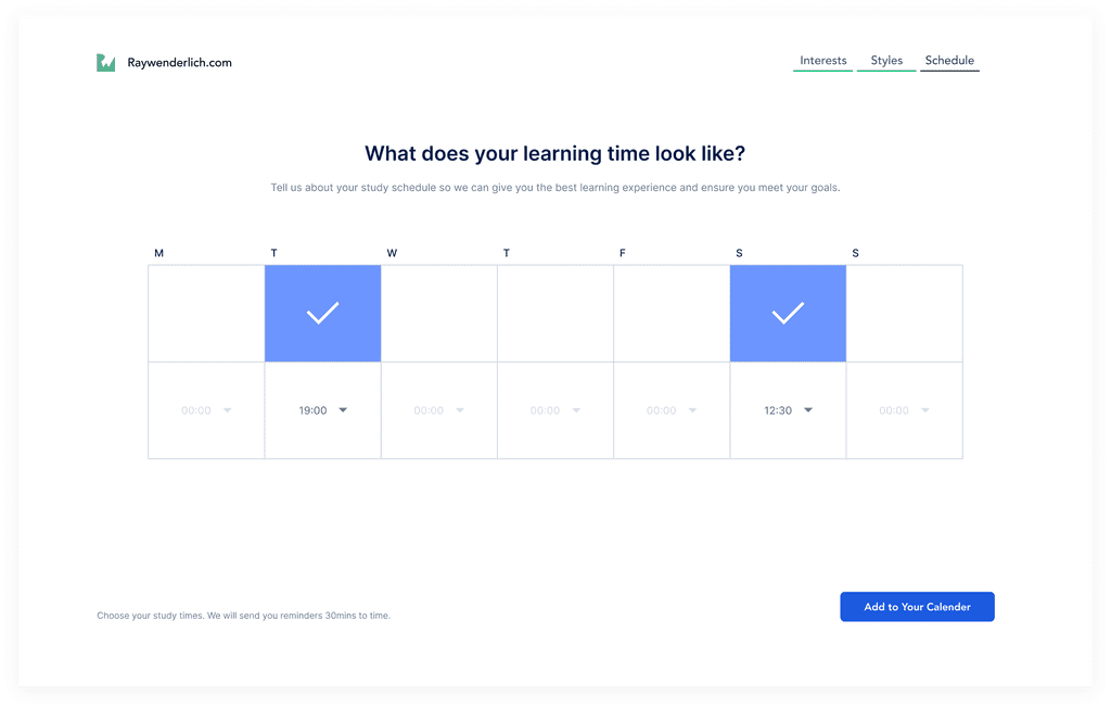
5. Learning Schedules
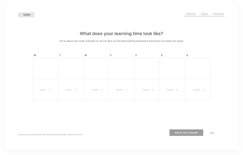
This page improves retention amongst users and creates a loop. It helps to gather data on what the user’s learning schedule and time frame are like. Users indicate their preferred learning timeframes and get the opportunity to sync their schedules to their calendars on their accounts/devices, that way they get notified with reminders to learn, timeframes to earn on badges/points, and not miss out on their learning goals. Users will receive reminders as emails, pop-up through calendars on mobile and desktop devices,
This feature gives Razeware the opportunity to market its add-on offerings (webinars, career opportunities, discounts, books, conferences, etc) to users via email marketing through the study reminders that'll be pushed to them.
Summary
The onboarding process I have created is an experiential one, allowing me to learn from my users as well as show them what is possible when they learn from me. I intend to take my learnings from their responses about their habits and behavioral experiences as regards their life generally and learning to be able to know where to drive their curiosity as well as motivate them.
This onboarding also captures the goals, motivations, and weaknesses represented in the User Persona hypothesis, making this a viable onboarding design.
Hi-Fidelity
Extras
These were some additions I made after not observing them on the Raywenderlich site. These additions are all validated by the tested and recommended theories and principles published by Product-led growth platforms.
Welcome Modal
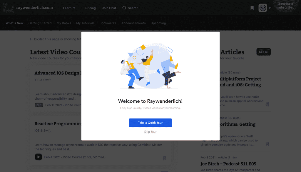
Every user gets appealed to by human-like activities from products. These activities prompt a sense of belonging, security, and warmth. Using welcome modals to signal the end of the sign-up and major onboarding steps is a good way to make a user feel at home. The design I created also hands them an option to get a tour of the platform or to skip it totally and proceed to business.
Tour Cards
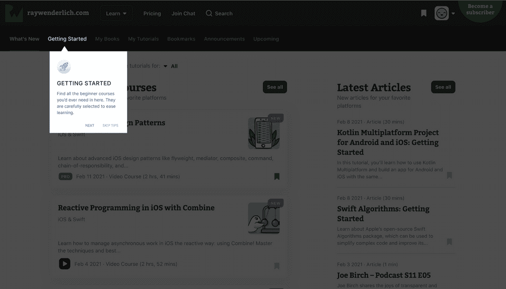
Should a user pick to get a tour of the platform, these tour cards will open up on important navigations, spots, or features with a brief about what they are. There is an option for next or to discontinue by skipping.
Just at the bottom right of the screen is the progress bar card that shows you how much further till you are done. This is quite useful for giving users a sense of time so they don’t presume the tour is a long and time-wasting one.
Less Invasive Guide
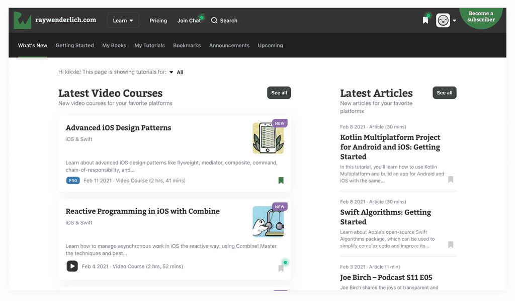
In a case where a user decides to skip tour from the welcome modal, there remains an option to get a guide/tour at any point something important gets confusing. This less invasive guide is displayed in the form of pulsating ellipses which is very small and less obstructive, a user can click on it at any point and an info modal will pop up. These pulsating ellipses are designed to usually last a month before they disappear totally.
Make Over Screens
These screens were just visual makeovers of some of the existing screens.
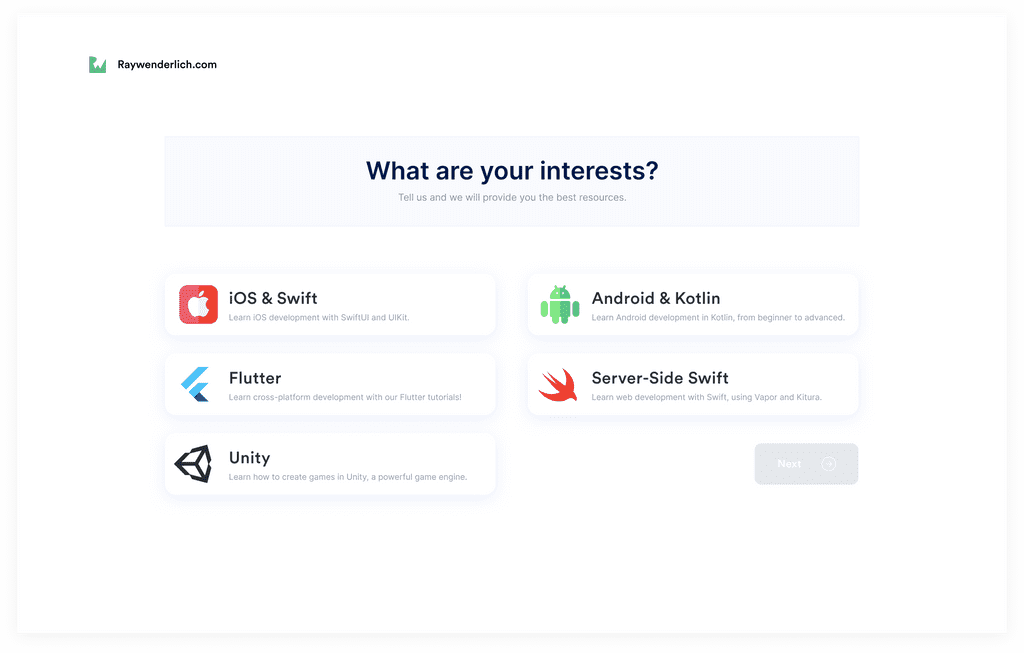
......
All these onboarding improvements are aimed at ensuring user acquisition right from the point of intentionally or unintentionally clicking on the sign-up button, down to when they watch their first video and have a prompt to subscribe to watch further.