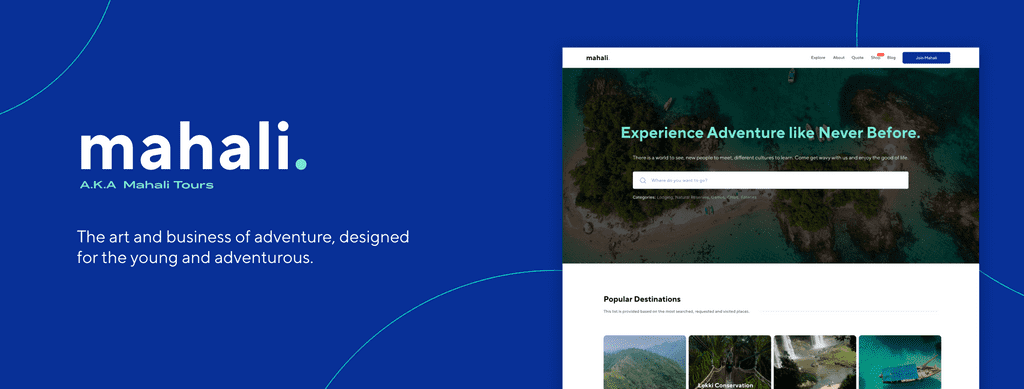
This case study was published with the consent of the great team building Mahali Tours. All content and design rights are reserved by them. Despite their consent, there are still restrictions and reservations on the extent of what I can show about the product, as it is yet to be launched. However, I was able to put out a useful amount in this case study. Enjoy!
Background
The past decade has seen a dominating presence of millennials in the workforce across the world. Currently, it is projected that by 2025, 75% of the workforce will be dominated by the millennial generation of workers. There is a need to maintain a work-life balance so as to ensure workers do not burnout due to stress and fixed routines of work.
So let’s cut the boring lecture, I am stressed out, you are stressed out, we are all stressed out from work and could use some colors in our life. Prior to the world domination by the evil Lord Covid-19 (that’s the picture I always have in my head whenever I think of the pandemic😅), we had to deal with the daily commuting to and fro work, but now we are all stuck at home due to safety reasons. Gradually cities are opening up and events are getting back to life, many people are looking for something safe and fun to get a break from their prison walls lol.
Clubbing, parties, and networking events have become routine that they no longer excite an average millennial as much. There is a need to see new things, do new things, meet new people, discover new cultures, and have lasting memories with them. Many people are looking to tourism as a way out not just to have fun and shake off work stress but to also discover new and exciting places, see Nigeria, See Africa and See the World. It’s a short life eh🤷🏽♂️ we might as well make the most of it.
This is where Mahali comes in😎.
So who is Mahali?
Mahali Tours is a tour brand offering Adventure as a Service by packaging and selling adventures, trips, and every other event centered around fun, with direct payments, and credit subscription models as well. Mahali was born out of the need to help millennials, working professionals, and every other young Nigerian to build a great work-life balance, by exploring Nigeria, and Africa for a start. Mahali exists to disrupt the tourism sector in Nigeria by changing the way tourism is approached and perceived in Nigeria, through the provision of a robust resource platform for people to have necessary information and reviews about locations. On the side, Mahali is to open foreigners to explore Nigeria and Africa at large.
This is aimed at preserving the cultural heritages across Africa and promoting the education and learning of important landmarks. Mahali is servicing companies for their retreats, team bonding sessions, and employee reward coupons. They are also servicing individuals directly as their packages are tailored to each group.
But like Bruh… what is the problem?
Nigeria and Africa at large are blessed with many great landmarks, natural reserves, wildlife, vegetation, historic places, cultures, etc. Sadly, only a handful of these places are explored to the core. It begs the question of why is there low patronage for tourism and tour brands. From an individual assessment, one can tell that there isn’t enough representation and packaging of these locations to entice millennials to visit. There is also the issue of limited creativity and service options to attract and sustain a user’s patronage to a tour brand.
There are many tour brands in Nigeria but there isn’t a distinct appeal to each. On the tech side of it, many of these tour brands only have informative and dormant websites with no disruptive services. There should be a balance between tourism education, data, and services to drive traction in this industry. When it comes to adventure, a good number runs one event per time which limits people from having options or picking which activity appeals most to them. The beauty of experiences is when you don’t feel confined, the availability of options, makes you feel unlimited, and attract you to be part of it.
Many other brands do not have flexible packages nor credit subscription models, hence, the fixed premium prices scare off millennials. There is also a huge distrust for tour brands by users as there is poor customer satisfaction, hence, a negative brand image. No one wants to be scarred so users would rather plan their own adventures.
All these and more are why millennials (the focus group for Mahali) are largely absent in core participation in tourism. They want something exciting, safe, vibrant, disruptive, and perceptibly affordable.
So what do we do, how will Mahali tours tackle this issue, build trust, and ensure people have fun without it feeling stressful and choices limited?
My Role in this Project
I orchestrated the trifecta of Product Design. Too much? I executed the UX Research, UX Design, and UI Design.
The Challenge
To design a seamless and hassle-free online platform for an adventure shopping experience, tourism education, and data resource for people seeking control over their adventures.
The Solution
To design a seamless and hassle-free online platform that features tourism education, reviews and data of locations, and adventure shopping experience. It should allow users the opportunity to have maximum satisfaction and control over their adventures, flexible pricing, and credit subscription models, building brand equity. It should also allow the client/brand to achieve its goal of disrupting tourism in Nigeria.
Design Process
My design process usually features these 5 fixed steps, unless otherwise changed by the team I am working with.
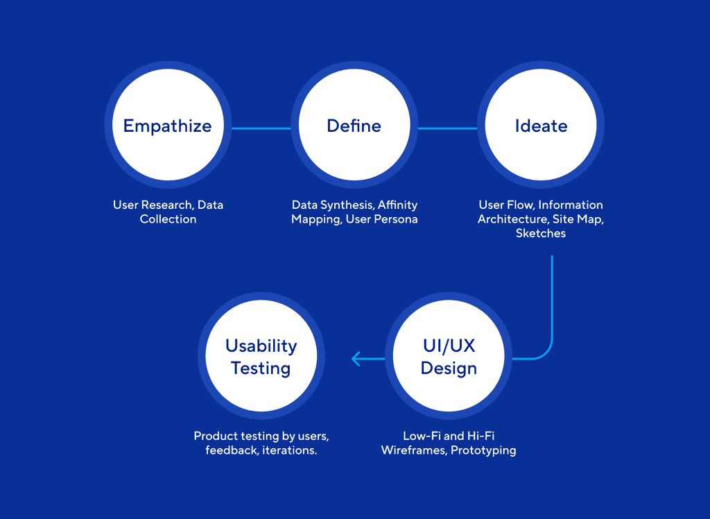
1. EMPATHIZE
User Research
To better understand the problem and what the user needs are, I carried out online research to check what data existed on tour brands in Lagos, and Nigeria at large. I also conducted an online survey using Formplus.
Online Data Search
During my search I discovered the following:
- There are over 332 registered Tour brands in Nigeria.
- Out of these 332 tour brands, only about 10 are prominent and own a bulk of the market share.
- These 10 have a core focus on hotel reservations, flights, and travel packages. None of them caters to millennials and working professionals seeking an array of options for inter and intra country trips, and weekly activities.
- None of the 10 brands has a young vibrant appeal for millennials to identify with nor many flexible payment options.
To further understand and observe what design patterns existed with platforms of tour brands, I went on to study competitor’s websites and products to gain insight on the modus operandi and potential leaf that can be borrowed by Mahali.
Common Design Patterns observed
I browsed through different apps in this niche and found the following common design patterns:
- Flight booking services
- Highlighted information of locations (mostly generic)
- Travel Insurance
- Hotel Deals
- Car hire
- Hotel Deals
- Statistics of Milestone crossed
- Visa packages
- Popular destination tour packages
- Travel Consulting
- Installment payments specifically for visa packages
The majority were into the core of traveling and visa processing, generic information of locations, and hotel deals, as they were targeting foreigners. This is quite a challenge and why there isn’t fun and vibrant outlook to tourism in Nigeria. It can be observed that these services are already provided by non-indigenous brands like TripAdvisor, Bookings.com, Hotels.com, etc. It is no news that foreigners and most Nigerians would trust and patronize them more due to familiarity and ranking.
Mahali on the other hand would focus on her mission of allowing millennials to see Nigeria and Africa while having the most fun. The art of building an indigenous community that speaks to the needs of millennials without projecting so much luxury.
Online Survey and Interview
Having understood what data stood for the tourism industry, it was time to now listen and understand the existing users (who are potential customers for Mahali). The target demography was the working class, millennials, Gen Z, and middle-aged. There was a total number of 75 participants in both the online survey. The approach to getting this number was by open and closed surveys. For the open survey, Twitter, Instagram, and Facebook were the key channels. An open questionnaire was shared with a cover image to call the attention of the target group. From my experience with surveys, people barely respond or give proper details on online surveys even if you offer money as a motivation. Many times online surveys are not enough/sufficient due to the fact that many people are too lazy to type or express their concerns/pain points with a product/service/industry. The approach taken was to individually interview 10 volunteers out of the 75 participants, have fun with them while asking the necessary questions, and recording the responses.
Key Findings
During my research I discovered the following:
- 46% of respondents do not patronize any tour brands.
- 90% haven’t done much touring and traveling due to the pandemic but are very willing to explore and get on board one.
- 70% of respondents shared similar expectations for tour brands, with most recurring expectations being safety, customer satisfaction, value for money, exciting activities.
- The most occurring frustrations/pain points were poor organization, lack of fun activities, limited options, pricing.
- 95% are very open to flexible payment options.
- 90% indicated they seek out events and tour activities to attend at least every weekend if the price is right and the location nice.
- 67% indicated they are willing to travel out of Lagos to new locations at least once every month due to work and tight schedules.
- 95% would like to gather at least once every week to meet new people, eat at new locations, network, unwind, play games, and share experiences with people.
2. DEFINITION
Research Analysis
Collecting data is pretty fun but the work always comes in making sense of it and filtering what’s needed/useful. Having documented the responses from the survey, it was time to define the users based on patterns from the responses.
To define the users I simplified the information gotten from the first stage of the user research. This was achieved by taking the following steps:
- Filter the responses and group the patterns using Affinity Mapping.
- Narrow down the patterns and report the Top Findings.
- Create individual User Personas
Applying the above steps I was able to see what problems were prominent and what needs were key to define the ideation stage and product features.
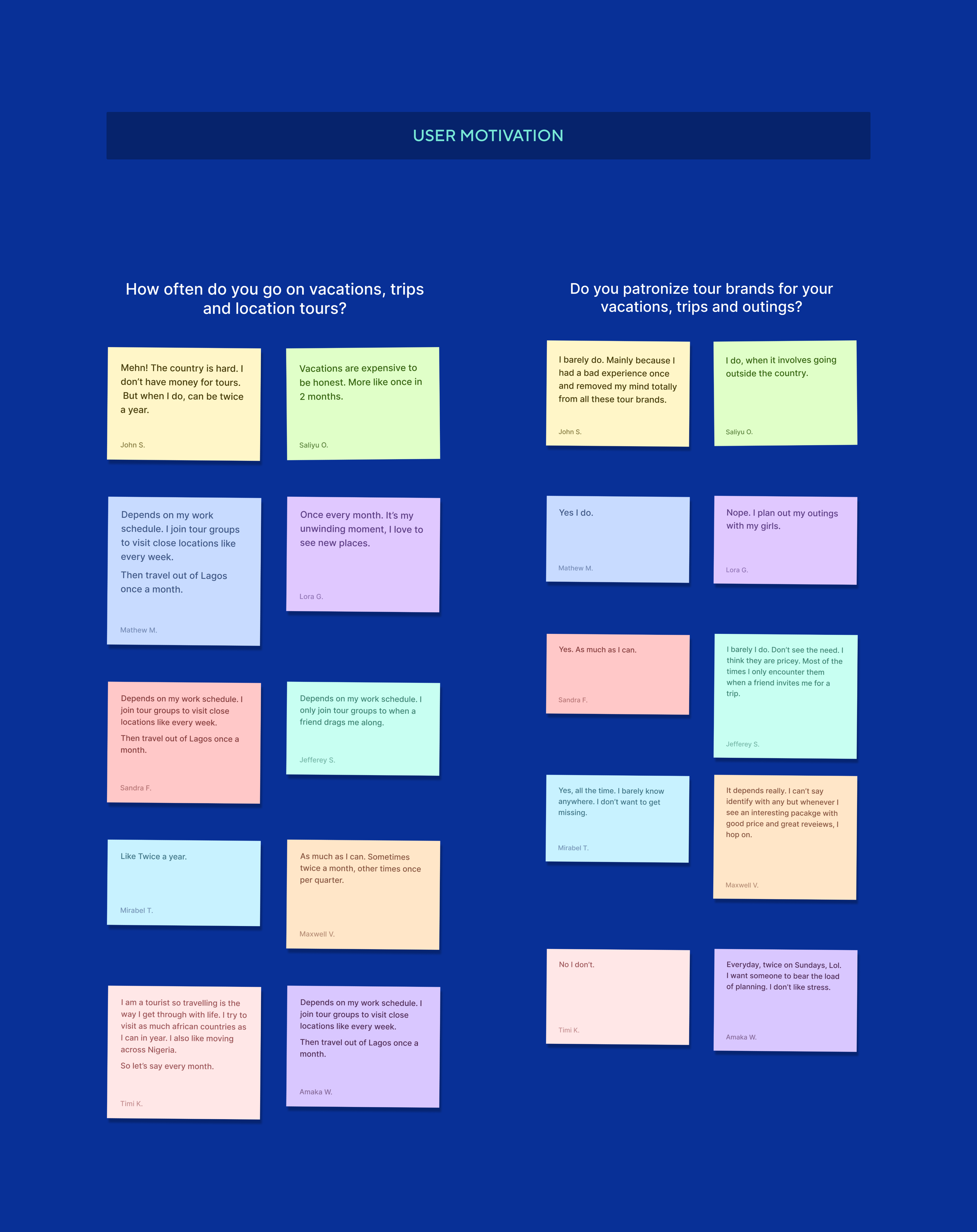
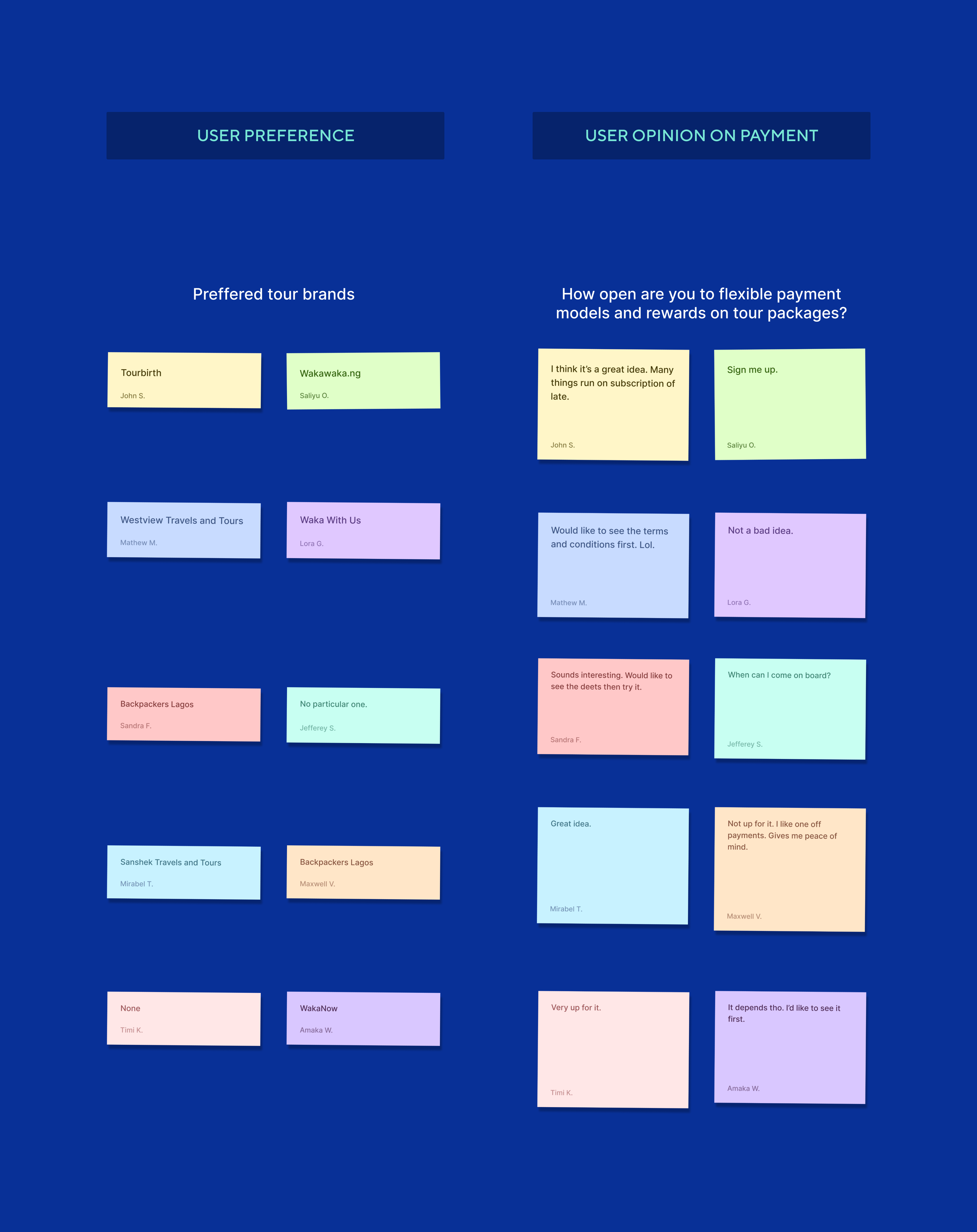
Affinity Mapping
The responses were categorized into four user response groups. These groups comprised the 10 participants that took part in the zoom interview.
-
User Motivation
-
User Behaviour

-
User Preference and User Opinion on Payment
Key Findings
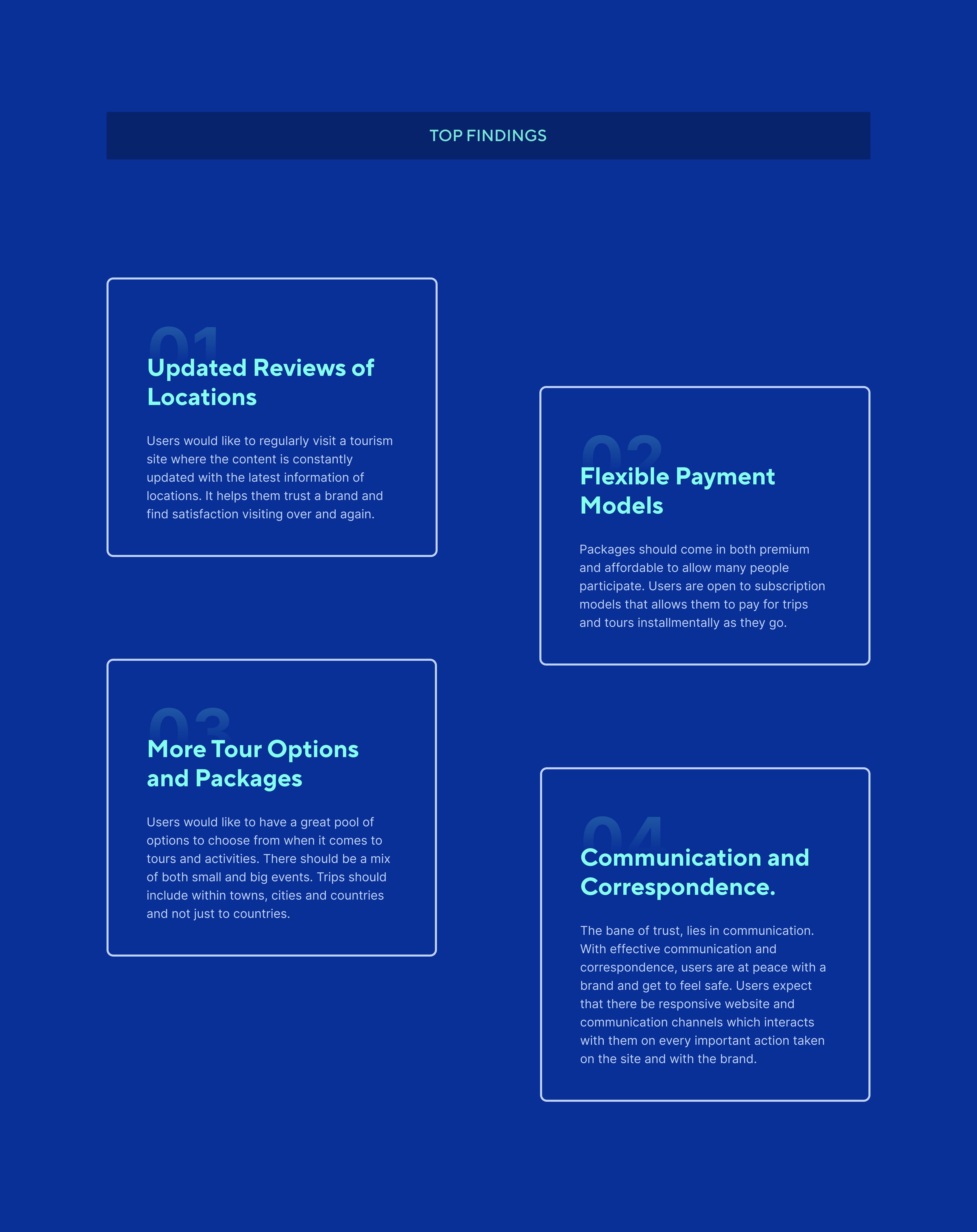
From the affinity mapping and response categorization, there were many findings but narrowing it down, these are the top 4 which defined the problem and users’ needs.
- Updated Reviews of Locations
- More Tour Options and Packages
- Flexible Payment Models
- Communication and Correspondence.
User Persona
Two user personas were created for this research and they were created based on deductions from the survey and also from combining the data obtained reviewing competitor brands.
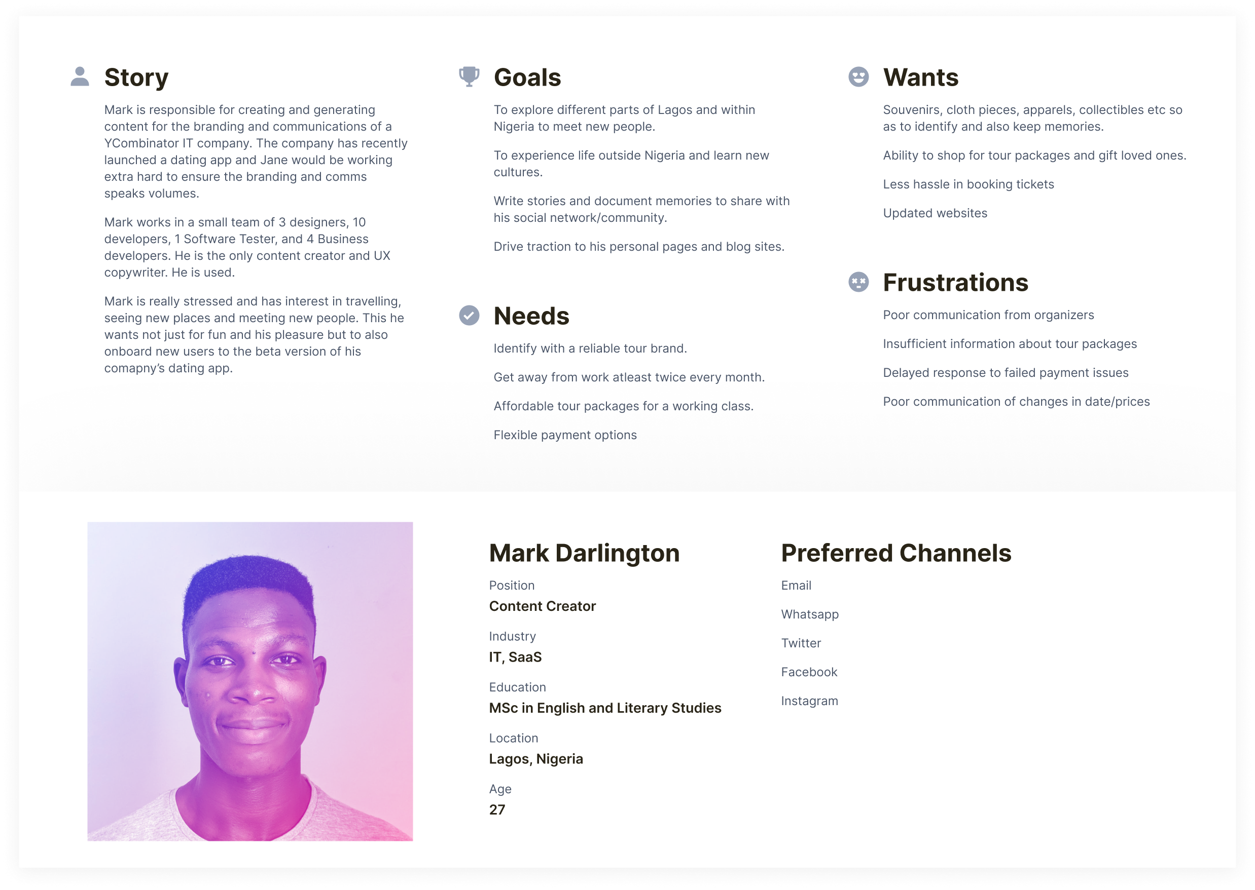
User persona for User A
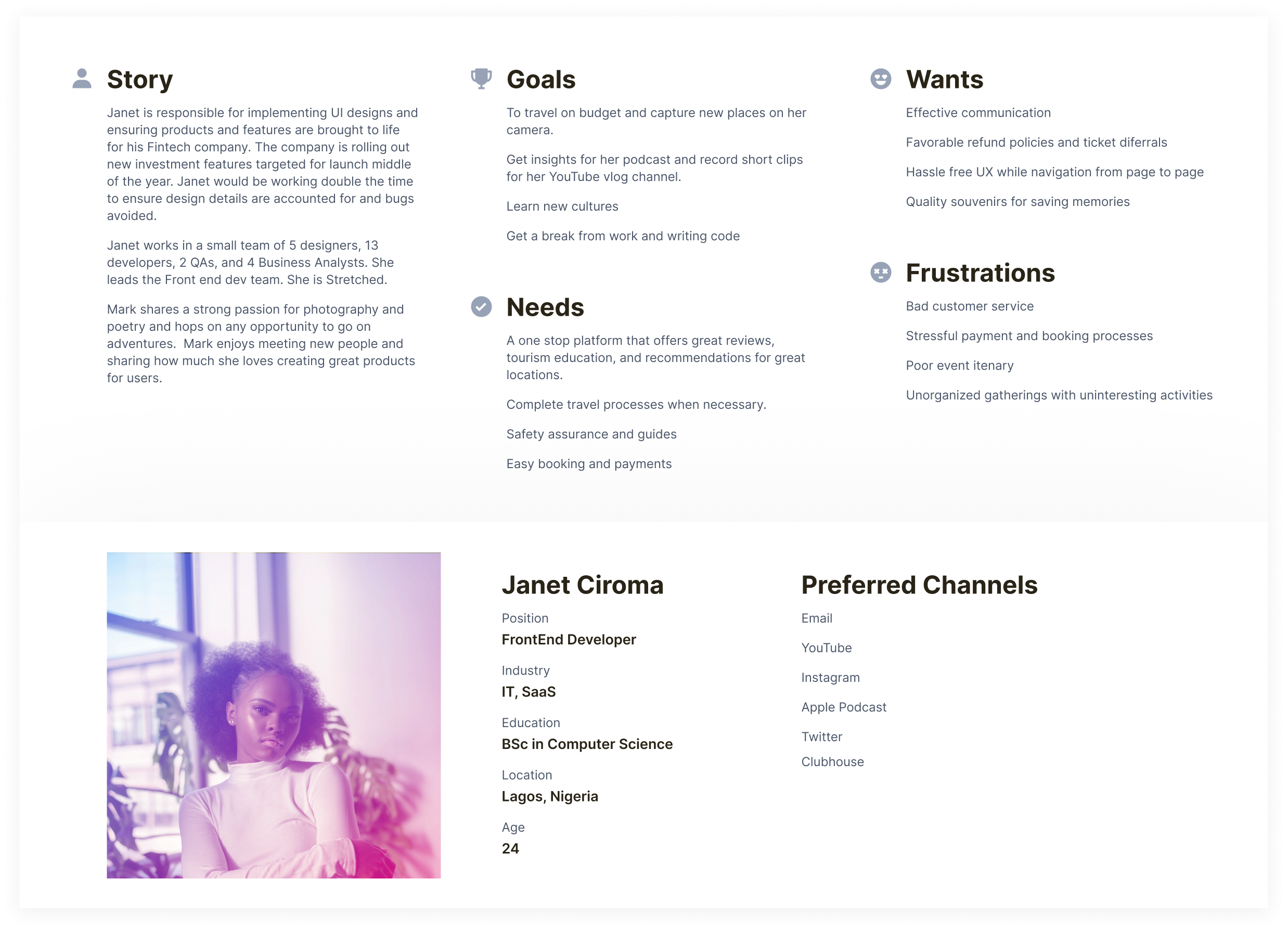
User persona for User B
3. IDEATION
Project Strategy
Upon synthesization of data and survey outcomes, I itemized all necessary features for the platform, nice-to-haves, and future updates. Below is a product feature roadmap of key features needed for the product to take off. Also threw in those that aren’t of high priority, all aimed at helping the project achieve its goals.
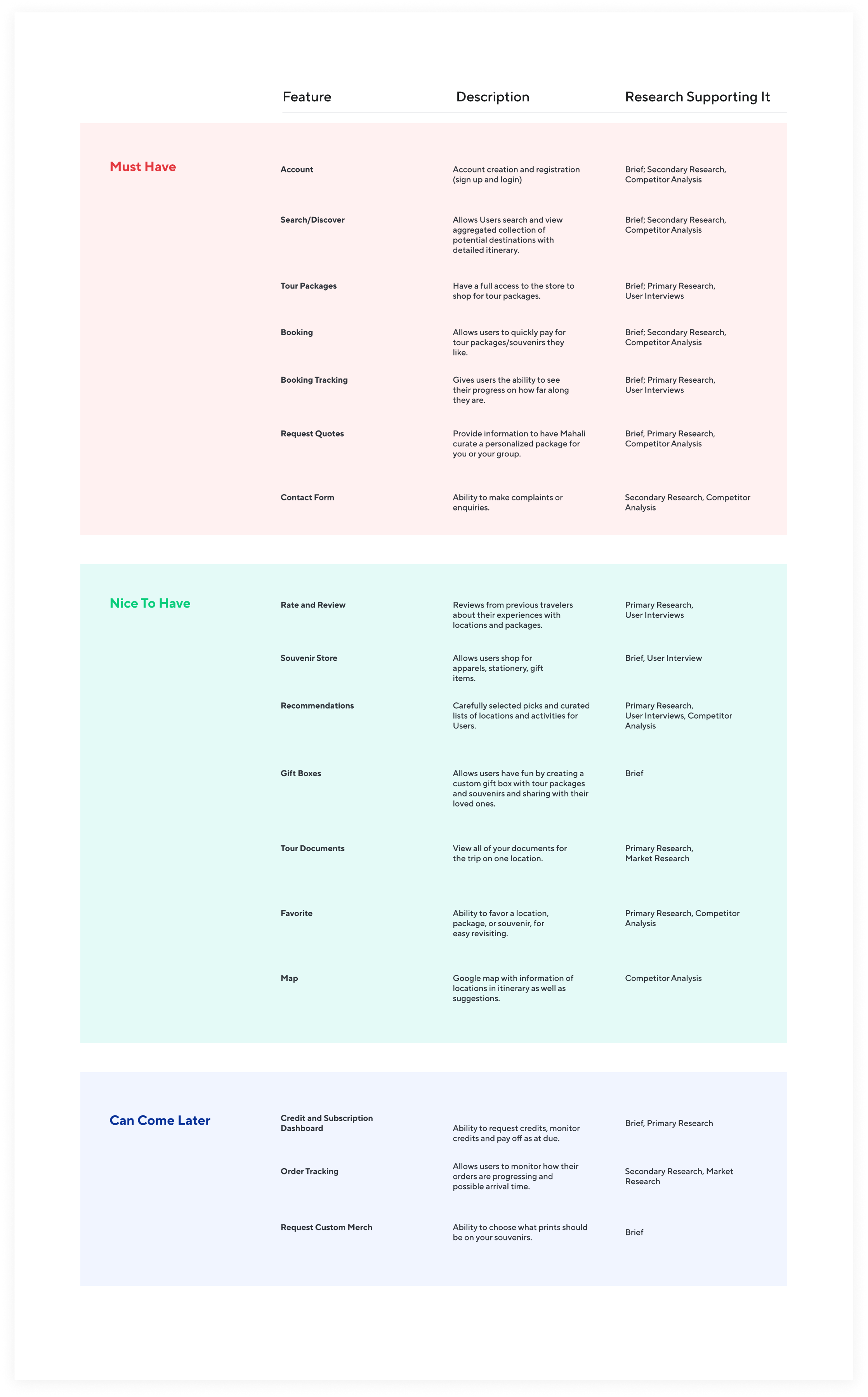
Product feature roadmap
Information Architecture
Having understood what Users’ needs were and created a Product Feature Roadmap, ideating the most important features needed for the immediate, it was now time to bring the product to life. At this stage, it was time to describe what the skeletal framework would look like, which would inform the wireframes, and also how people would interact with the website.
the wireframes, and also how people would interact with the website.
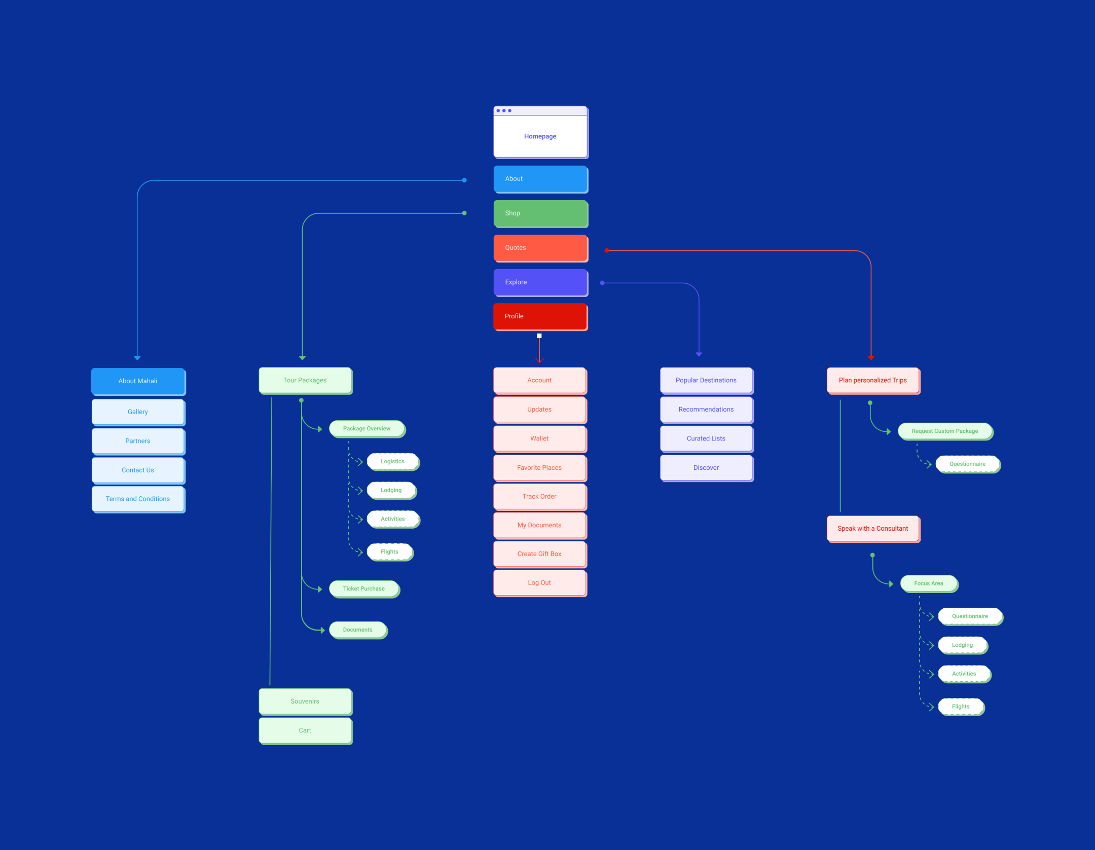
Information architecture for Mahali
For the purpose of Disclosure agreements, there is a limited amount of images and details I can share, hence, why the IA is as brief and minimal as possible. Also, images of the User Flow Chart, User Journey Map and Site Map are withheld.
Pen and paper sketches
My approach on projects after crossing the ideation and skeletal frameworks are to make hand sketches using a pen and paper to illustrate what I want the product to look like. I always iterate on my sketches till I get a satisfactory layout that delivers the features in the best way possible without ruining the user experience. FYI, I draw/sketch better than this on a good day 😁
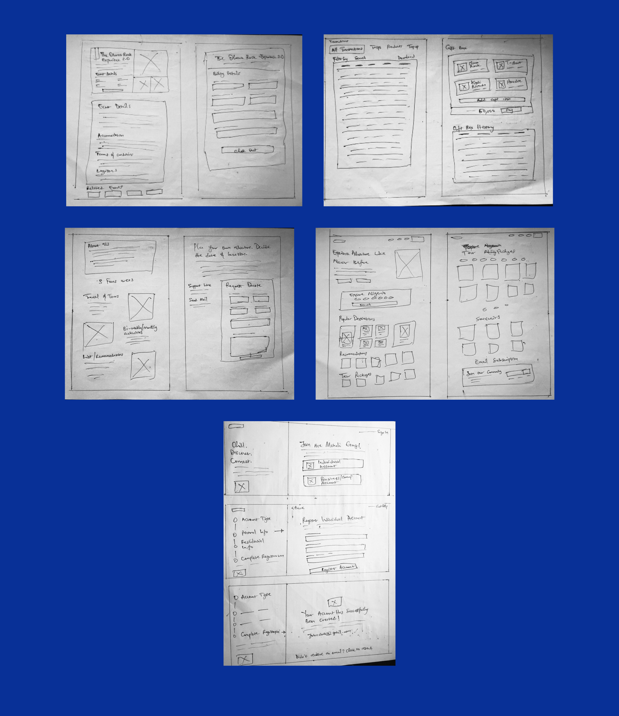
Paper and pen sketches for the web platform
4. DESIGN SOLUTION
Wireframes
Working with the flow charts and paper sketches approved by the team at Mahali, I moved in to design the product.
Low Fidelity Digital Wireframes
Upon agreeing on the satisfactory layouts for the pages it was time to move sketches into digital frames and tweak upon the paddings, frame sizes, image sizes, and grids. This was done in Figma where I iterated severally to get the desired structure, layout, and screen components.
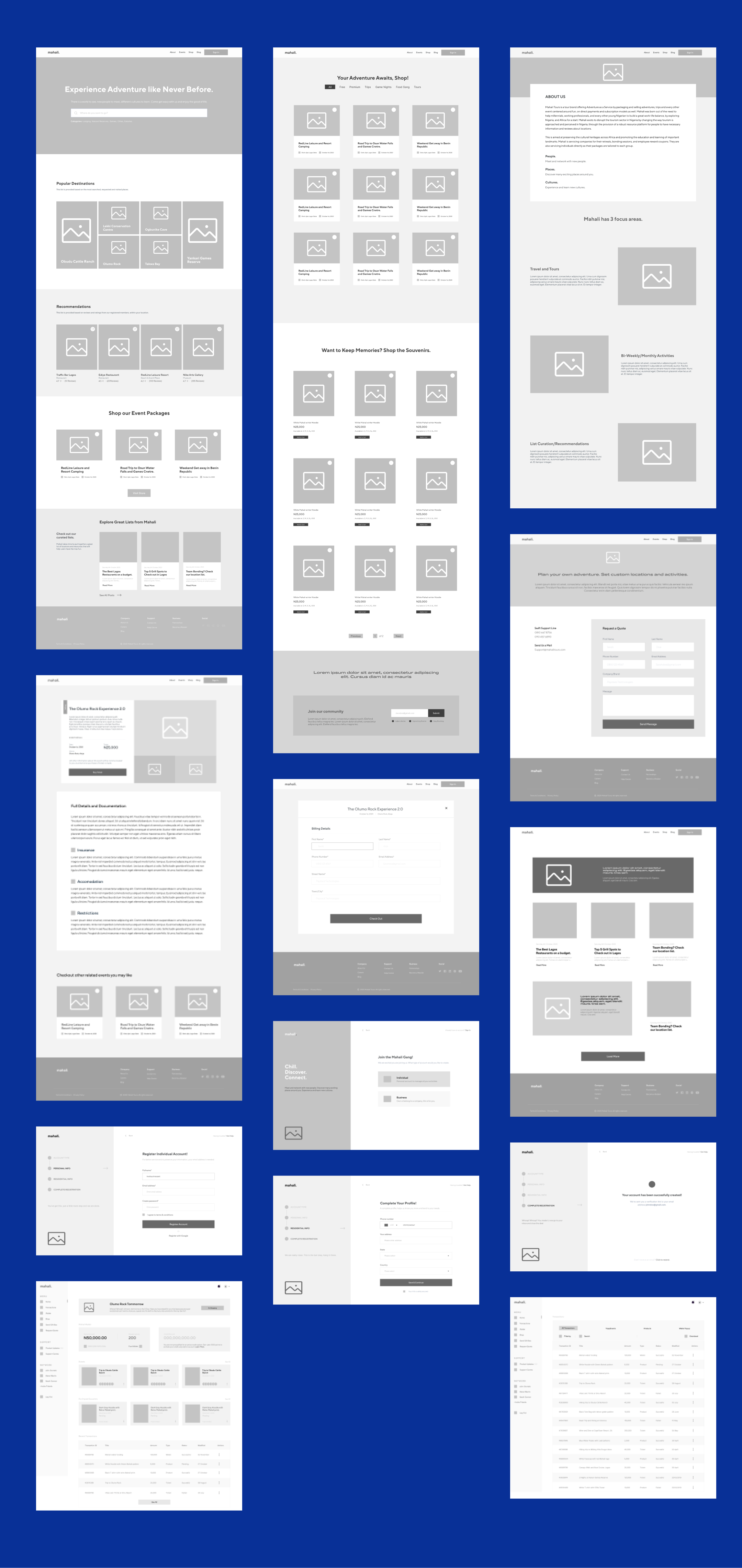
Low fidelity wireframes for the web platform
Style Guide
For the sake of reservations on what I can show, I am able to put out only the brand fonts and colors, and an accompanying mood board.
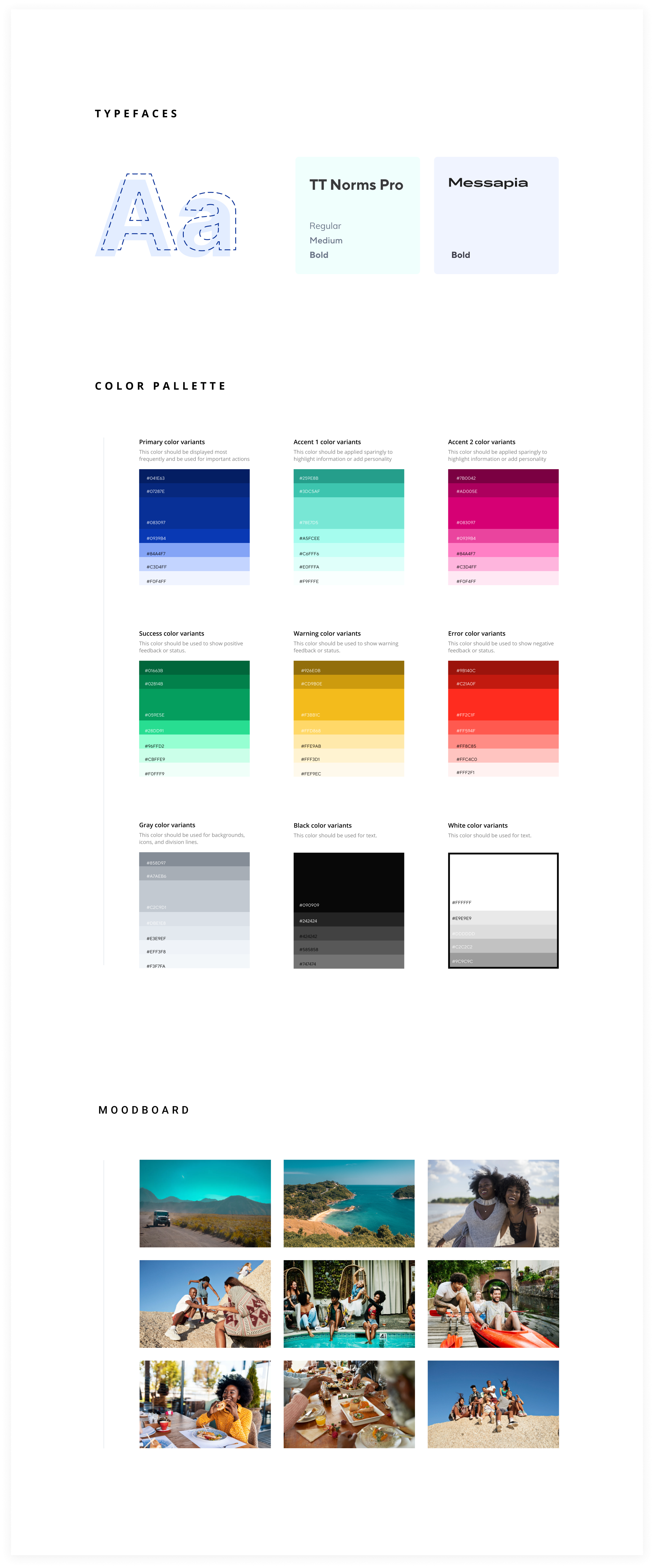
Mini style guide for Mahali design
High Fidelity Wireframes
Having created satisfactory Low/Mid-Fi wireframes and defined the style guide, it was time to move the visuals to High Fidelity and bring the project to life.
I will be highlighting the main default screens and the design rationale behind them.
Landing Page
The landing page was designed with the user’s needs in mind. It has a navigation bar that has all the major navigations. On the landing page, it features a hero section which allows a user search for their desired location or a place they wish to get information on. This is in a bid to ensure enough information is made available to tourists and site visitors. There is the presence of ‘Popular Destinations’ which is curated by the algorithm of user traffic, showing a combination of the most searched, requested, visited, and reviewed places. This is followed by recommendations, a section to highlight Mahali’s well-sorted choices for users based on reviews from users and in house team. After this is the shop section, highlighting 3 top trips/vacation packages, with an option to visit the main shop page. The page closes with the blog section highlighting 3 of our curated lists with the option to see all.
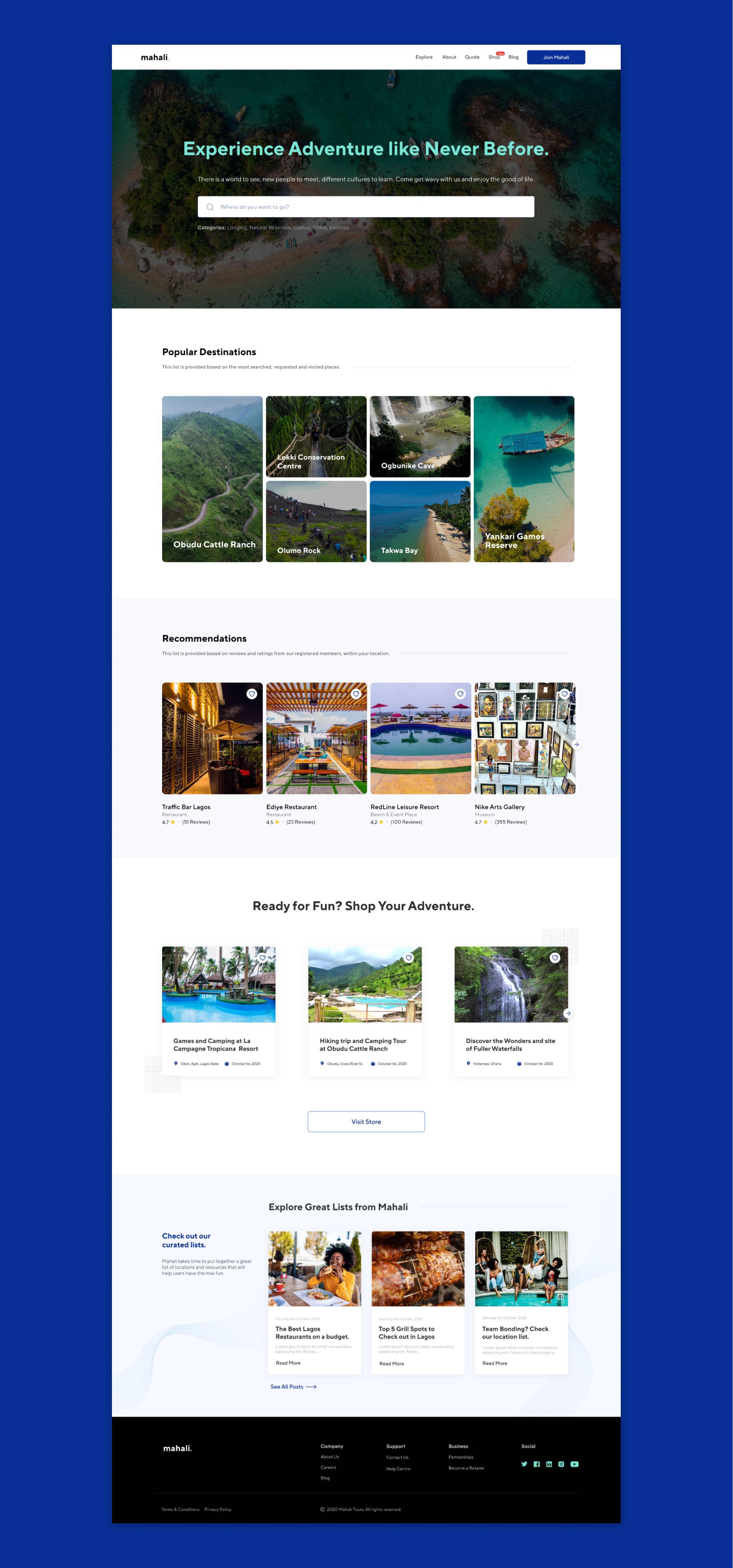
Landing page for Mahali
The Shop
This page was designed to give a simple, easy, and minimalistic shopping experience. Events are grouped in categories and we ensure that the events are not too many that a search bar will be required. With this, users can easily check through what we have available. There is also the option to shop for merch and apparel to help them be part of Mahali and keep the memories of the adventures they've experienced.
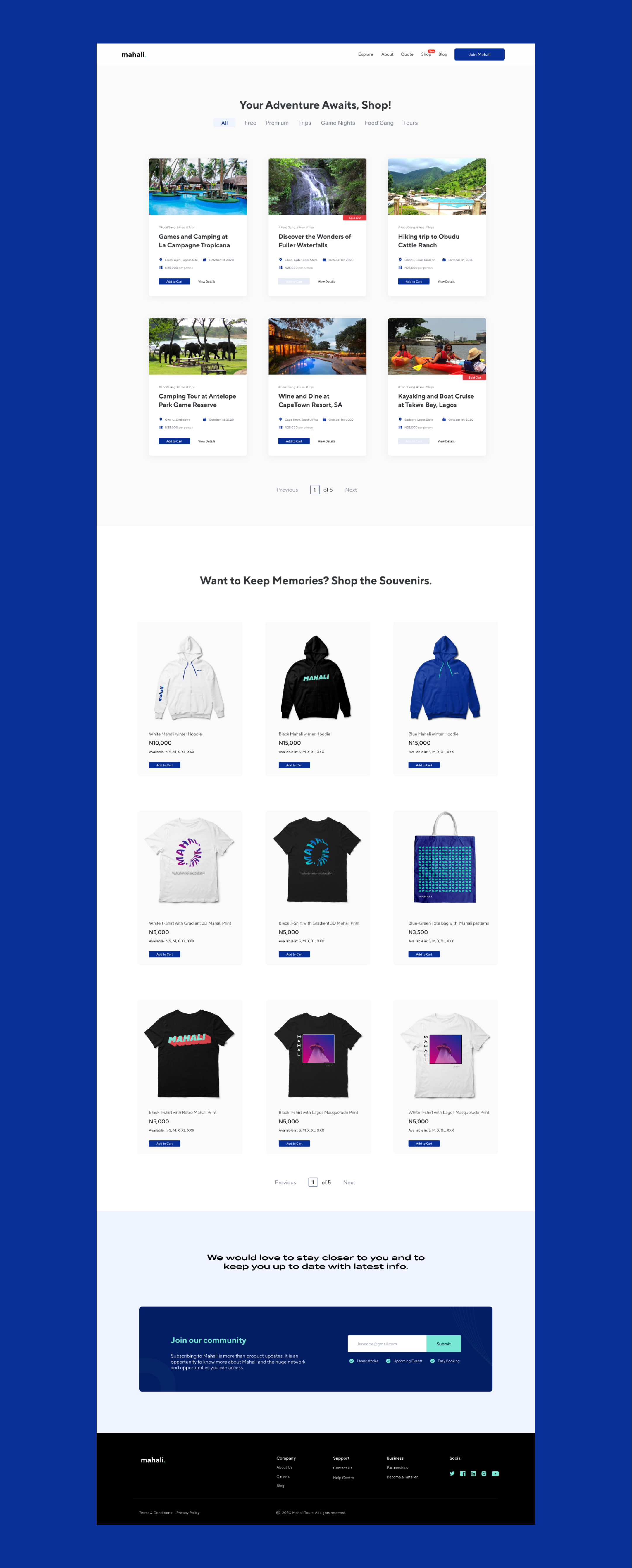
Adventure and souvenir shopping page
Request Quote
This page is very straightforward and caters to those who wish to have custom vacations/trips packaged for them. With this, you can send a quick message requesting a quote based on the information provided. There’s also the option of call with the contact center to help get clarity on itinerary and pricing.
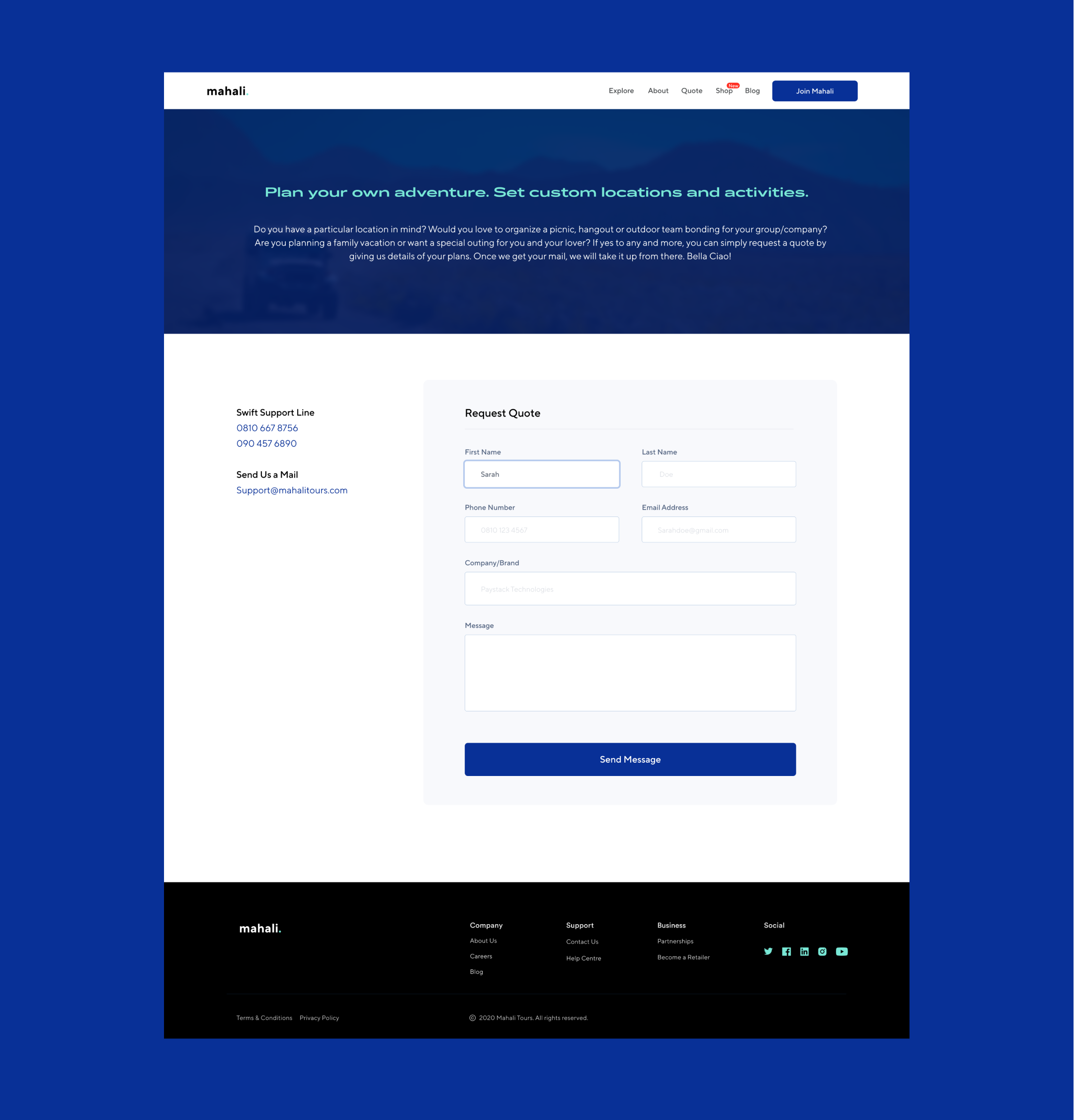
Request quote page
Blog
On this page, users will be able to read adventure stories, curated lists, general vacation articles, and exciting product releases.
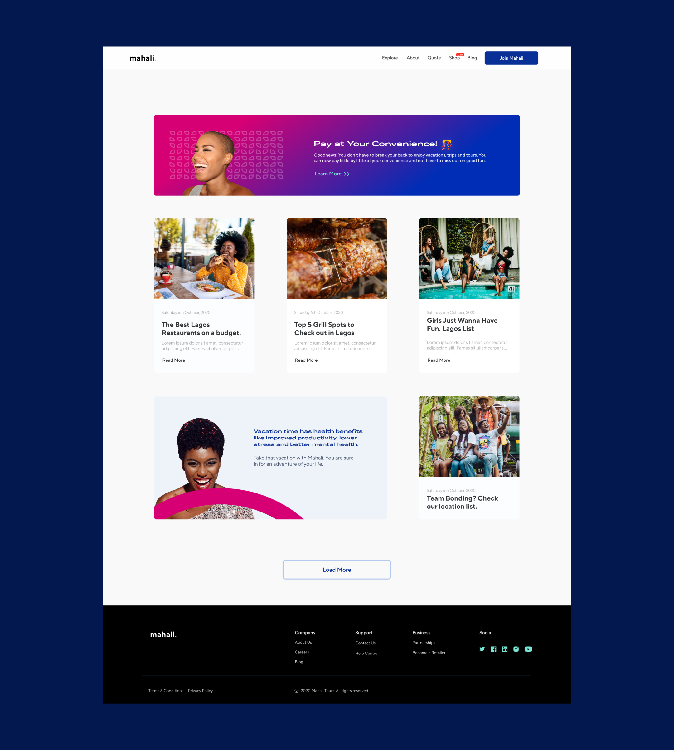
Blog page
Efficient Dashboard
The platform features a simple yet efficient dashboard for users that choose to sign up on Mahali. It allows users to own and fund a Mahali Wallet for easy purchase of tickets and apparel/souvenirs. There is also an option for credit record, a section that activates when you’ve earned up to 1000 points. These points accumulate based on your spending on the dashboard. When it’s activated, you can go on trips on credit and pay later or in installments as you wish. This can be made faster when users connect their salary account to their Mahali wallet. This is to ease the burden of payment of vacations on users. On the dashboard, you can track your product order, easily check the itinerary of a trip, confirm your documents, connect with your friends, and see who is attending the same event as you. You also have the option of creating a gift box, where you send a pack containing tickets, souvenirs/apparel, to a friend, colleague, or employee. Full details of this and how the Corporate/group account for groups and teams work will be made available during the product launch.
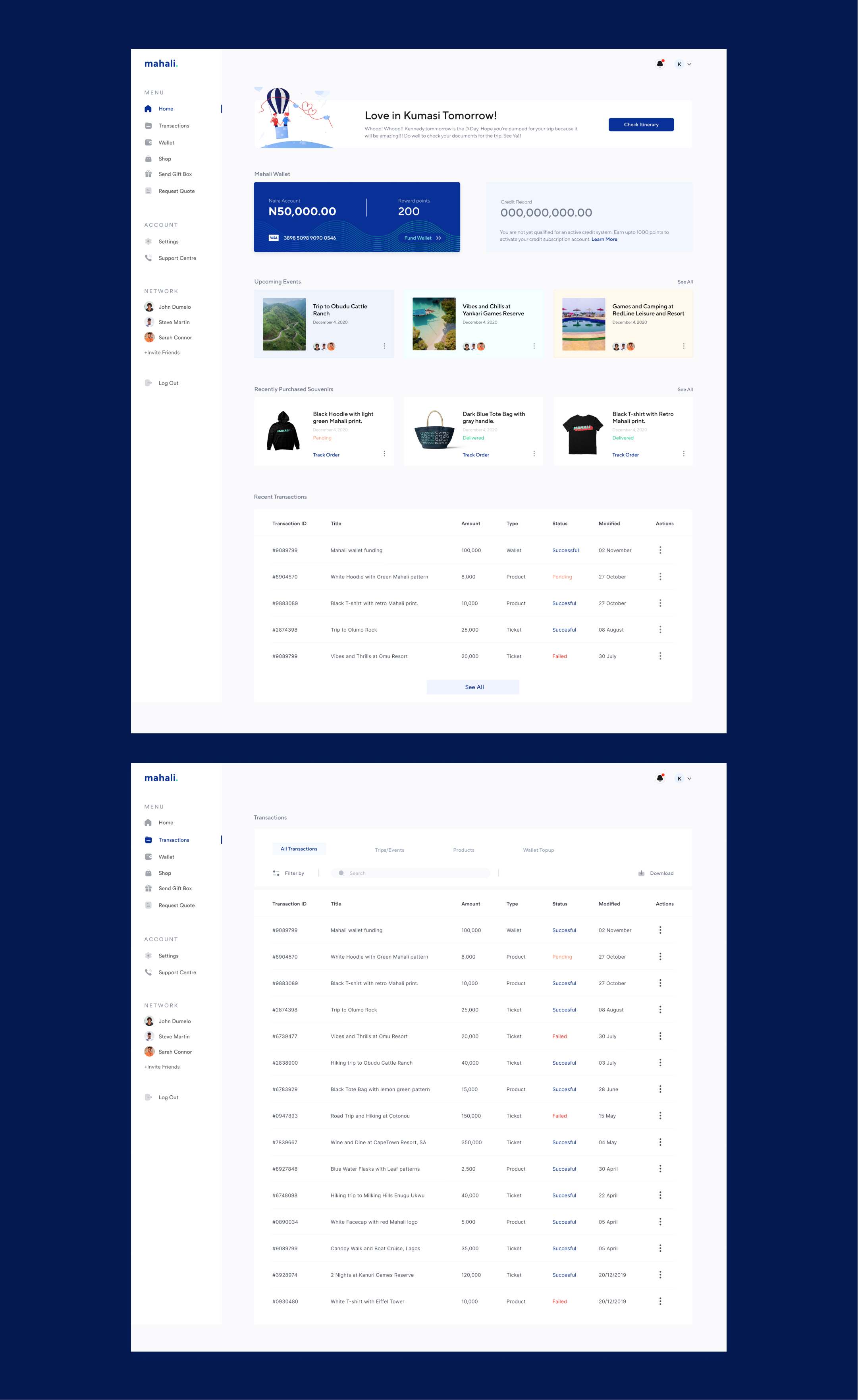
Two dashboard screens for Mahali
Seamless Signup Steps
To ensure a seamless account creation, there are simple and clean sign up steps created with ease-of-use in mind for users. They can choose between individual accounts and corporate/group account (this is particularly for companies, for their team bonding sessions, retreats, employee rewards, and other outdoor activities).

4 step signup pages for Mahali
Other screens
This features an Event details page, the About Us page, Payment modals, and a sold-out ticket card.
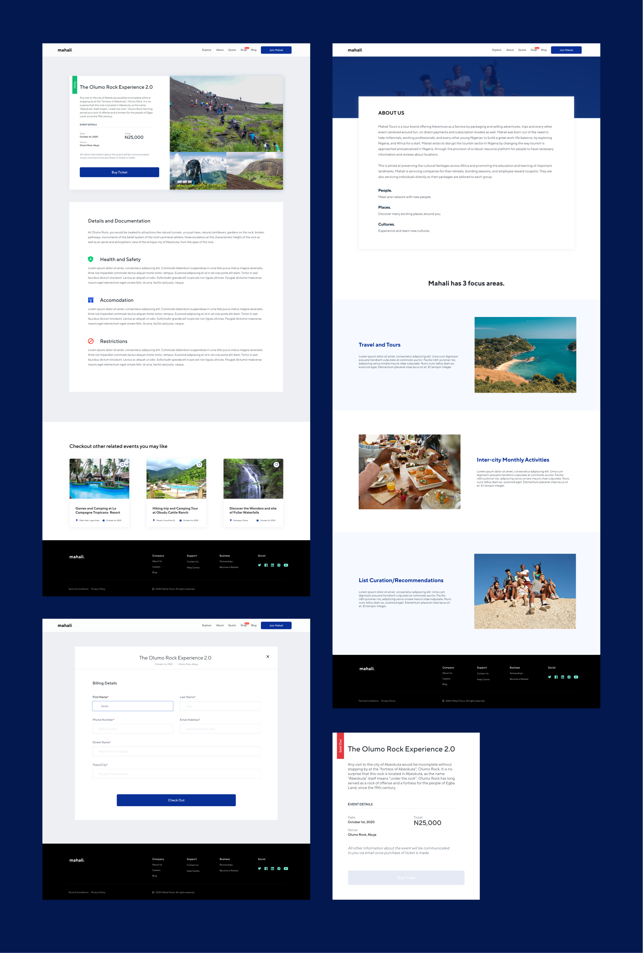
Extra screens from the project
To have a better view of the design presentation, and access the Figma prototype, please send a mail to iyehkennedy@gmail.com
Campaign Flyers for Post Credit Scenes… 😅 🎞
While bringing this product to life, I had the privilege to create some campaign flyers. You can check them out below. A full brand identity design presentation will be published on Behance by the team soon.
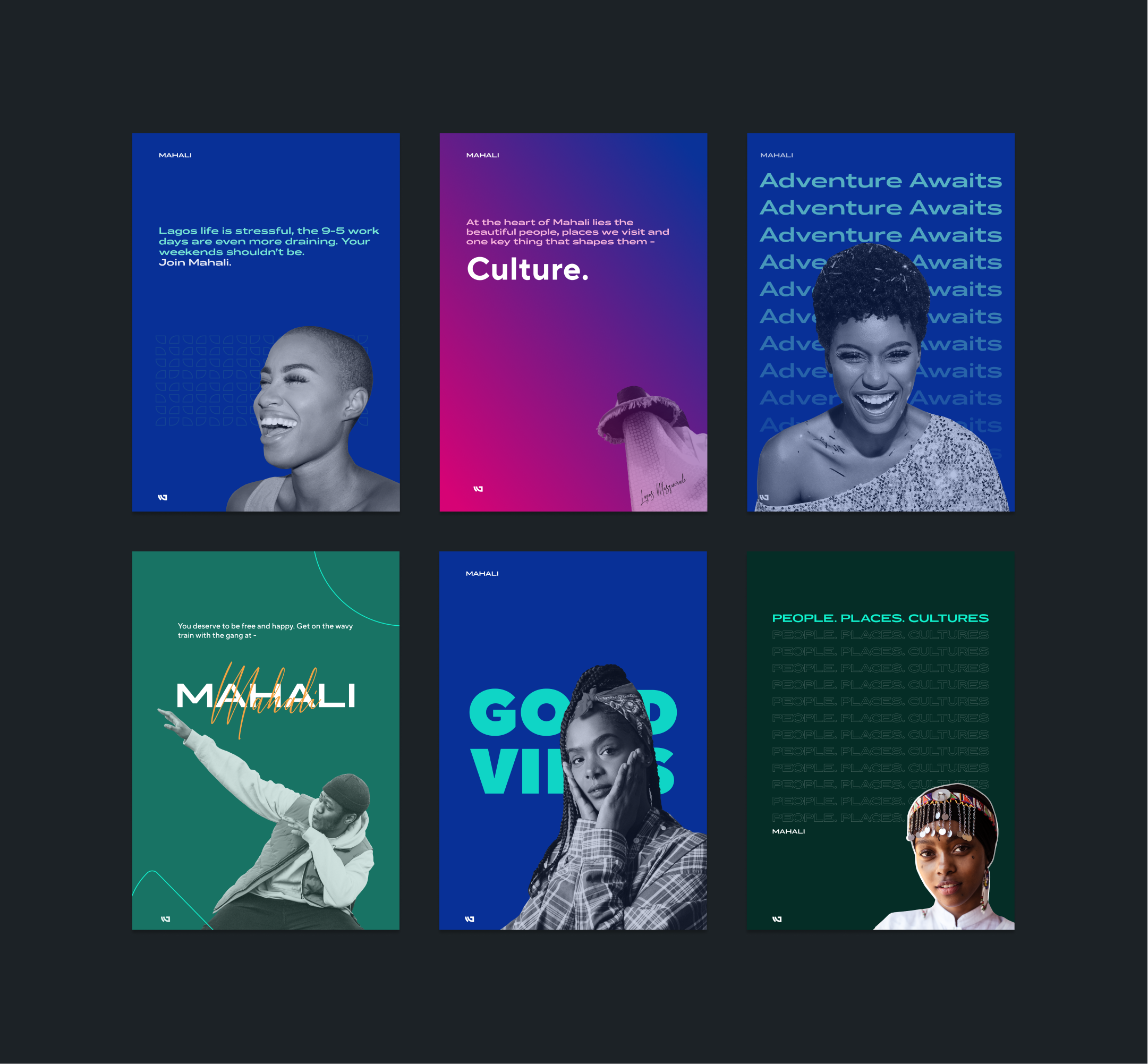
Campaign flyers for Mahali
Conclusion and Lessons
This single project opened my eyes to many aspects of UI/UX Design especially when it comes to research and data interpretation. But overall here are some handy lessons learned from this project:
- Always design for edge cases. Endeavor to plan and consider different edge cases that exist while designing your product to avoid hurting your users. This involves visual, interactive, and ethical issues. Think of your users first and how they feel, never be absorbed into your ideas that you forget it’s users first.
- Be confident in the small. Don’t be afraid or thrown off that your product or design inspiration isn’t fully formed or as tasty as you want it. As you design and iterate, it will keep improving and getting to what you want it to be.
- Curiosity never killed any designer. In order to be better and to put out better products, you must be very curious about things and the workings of a lot. It drives you to do better research, makes you find out better ways to implement or improve on a design. Curiosity helps you search for inspiration far and wide, and to learn new things.
- Teamwork makes the dream work. As a designer, it will be unwise to negate or downplay the importance of collaboration while working on projects. Be it freelancing or full-on employment. Always try to get a second eye on your project and ask for help when necessary. It helps you see things you might have unconsciously skipped.