Introduction
One of the reasons people work is to earn a living. Due to poor money culture, there exists a hand-to-mouth earning cycle. This cycle keeps them in the same financial condition for years. With the face of work changed due to Covid and how this affects the assurance of jobs for some people, it is necessary to promote a money culture. Money culture through financial literacy skills is important to help people build a stable life without the worries and struggles of job insecurity. Currently, there are various investment opportunities across the world, from the ones spanning decades to the new generation's creations. These investment opportunities cut across NFTs, Stocks, Shares, Crypto, Blockchain, Real Estate, etc.
With the new financial technologies emerging, people are seeing the need/importance of these technologies for financial upgrades and relevance to employment. People wish to keep up and not be left behind, but much mumbo jumbo and jargon are making it hard to keep up. It begs the question, where do we begin from, and how do we keep up? This is more important now than ever as FOMO (fear of missing out) is driving people above caution and leading to a high loss rate of money via scams, failed investments, etc. There is a need to break down this knowledge to help people thrive above poverty.
Goal
Design an instructional app to teach people financial literacy. An app that exists to simplify stocks, shares, NFTs, real estate, etc., for a non-wall street guy. This app is called *Monipro.* Monipro is a financial literacy and new technologies platform. This app aims to become the number one app for learning and staying informed about financial news without enrolling in institutions.
User Research
Study 1: Skill Learning and Career Transition
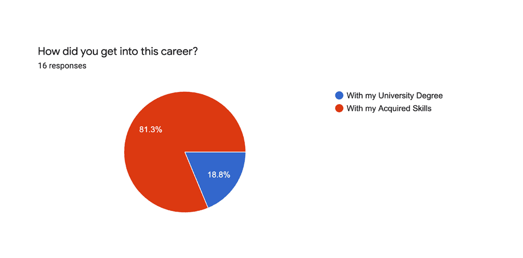
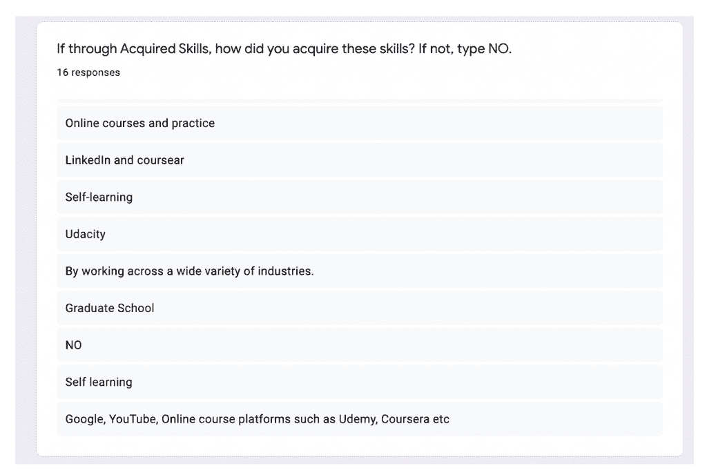
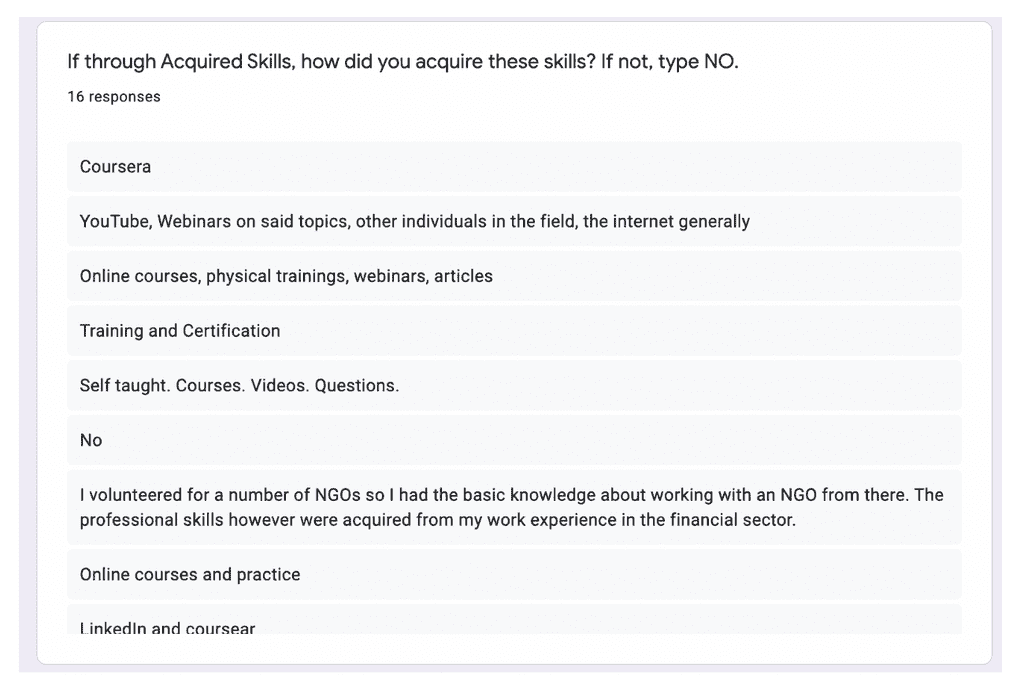
This survey was aimed at understanding the relevance of informal learning in career transitions and upskilling in the digital era and how this plays a role in the 5th Industrial Revolution.
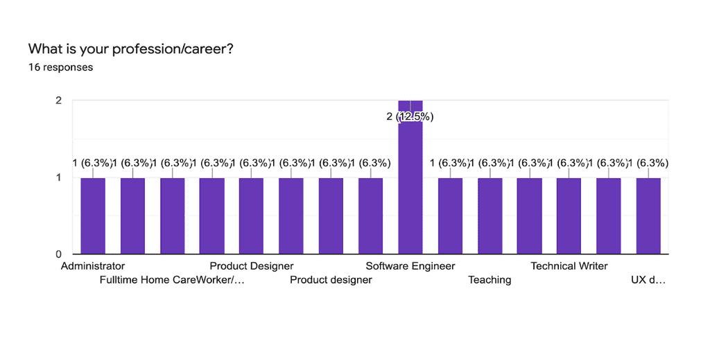
This survey features 16 participants between the age group 20-31 years. Questions and responses were achieved via Google Forms. Participants were recruited through career communities in Lagos, Nigeria, social media, and personal contacts.
The results were as follows:
Study 2: Investments and Financial Technologies
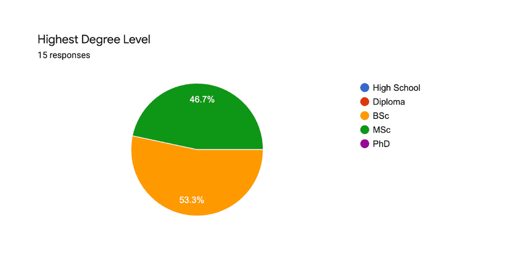
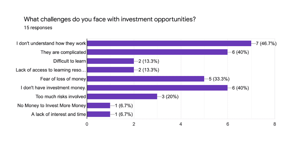
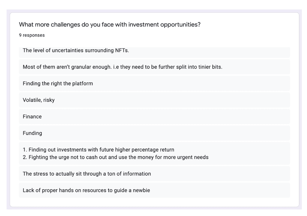
This survey and interview were aimed at getting answers to presumptions around the barrier to entry in investment opportunities.
This study featured 15 people between the age group of 20 - 31 years. I worked with the same audience for the surveys as it was difficult to convince new people to get on a call for an interview. It was easier to continue with the same people I had initially engaged.
The media of study used was Google meet, texts, and voice calls to interview these people. I couldn’t record the video calls, voice calls, or text messages. However, I tried to document the interviews using google forms so I can easily generate infographics and export them to my appendix.
The results were as follows:
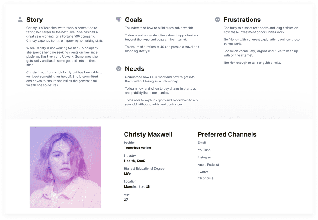
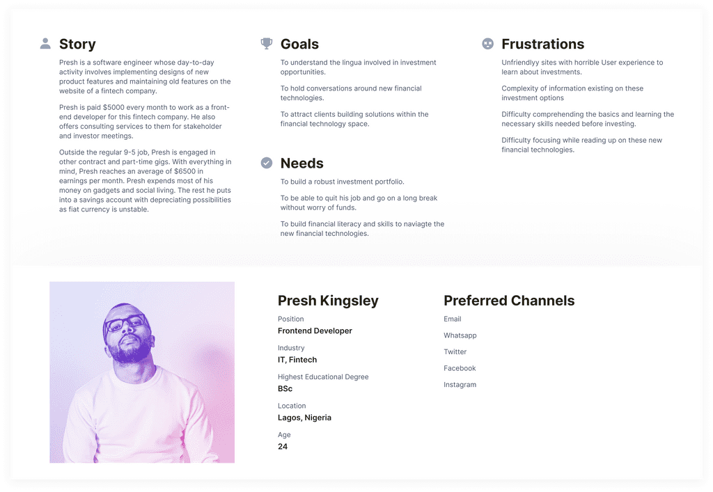
User Persona
A/B Testing
Brief
When creating products it is always necessary to identify the best variations of your work. At the beginning phase, I had intended to design a community-like learning platform that models platforms like Quora, Facebook, etc. Along the line, after much research, I had a rethink on the product perspective, especially with all I had researched on instructional design.
To validate what variation of my product was much more acceptable to the target audience, I created mockups of each and took user tests on them. The following is the report.
Product A
- Title
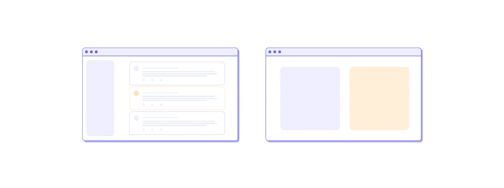
A community-based learning platform
- Goal
To help users learn financial literacy by engaging other people who are interested in the same investment opportunities.
- Product Description
Product A is a learning platform for financial literacy. Users register and are onboarded into the community where they meet and engage other users. They can ask questions on the timeline, make posts about their interest or investment activities and get answers/feedback. The platform will feature comments, likes, dislikes, bookmarking, etc. People can also message other users privately, request a call with them, or ask for advice from them. These users can be experts or newbies alike, it is a free community. New users are also given disclaimers and community guidelines regarding false information, fraud, scams, etc.
- Product Inspiration
Quora, Facebook
Product B
- Title
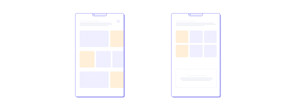
A financial literacy and skill learning app
- Goal
To help users learn financial literacy through gamified courses, adventures, and simulators, to build experience in investments.
- Product Description
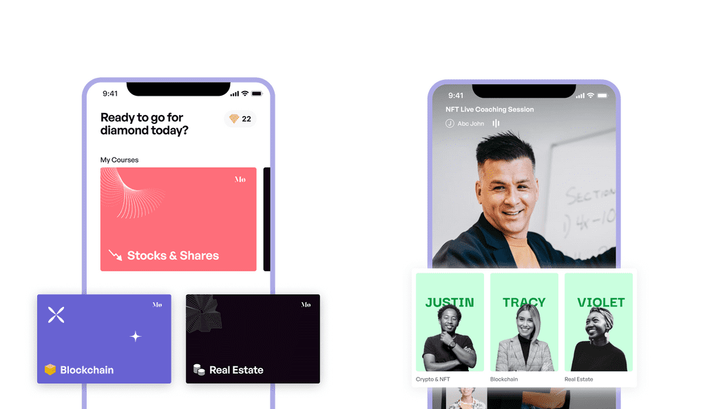
Product B is a financial literacy and skill app to simplify investments for users. It employs several instructional design models that ensure learning is fun and easy. Courses are cut into bite sizes, with more imagery than texts to reduce cognitive load and ensure stimulation. The learning process is gamified with users winning diamonds which they can convert to quids and use for transactions in the simulator. The simulator exists to help users practice what they’ve learned in a model of real-life investment platforms. Learners can partake in tournaments as groups or individuals, taking on games and quizzes to win more diamonds. There is also the option for learners to book and have live videos with well-selected experts to get advice or coaching.
- Product Inspiration
Duolingo, IKEA
A/B Testing Outcome
I sampled these two product mockups to a group of random people who volunteered on Twitter. I got 10 volunteers to review these and they all voted for Product B.
Reasons
- Product B doesn’t pose a financial security and safety threat, as you are not directly dealing with people you don’t know.
- Product B shows promise of delivering your goal of learning financial skills
- Product B appears to be a more fun, on-the-go, interesting-to-engage, learning app that resonates with millennials and Gen Zs
- Product B’s mix of games, courses, and live mentorship from curated experts seemed more inviting than A.
- The simulator in Product B which allows learners to practice what they’ve learned in a real-life model is something anyone would love to try.
Ideation
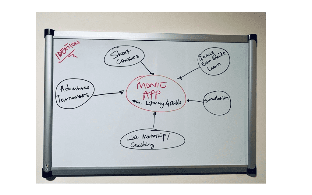
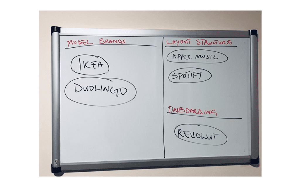
I itemized key highlights I wanted to be featured in this app such as short courses, videos, gamification, portfolio simulation, and live mentorship. I also tried to sample some successful apps in the market and how they are influencing this target audience - Millennials and Gen Zs.
Product Research and Sampling
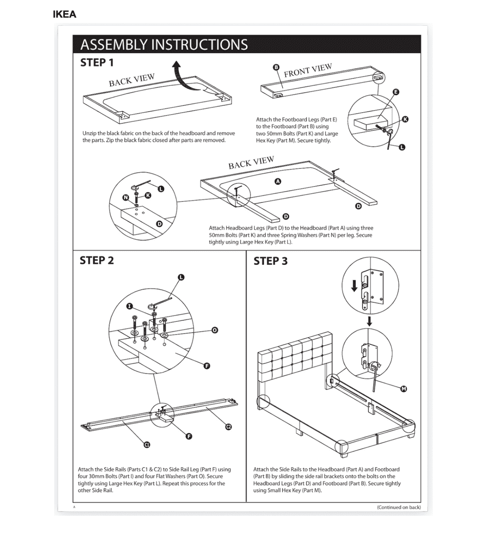
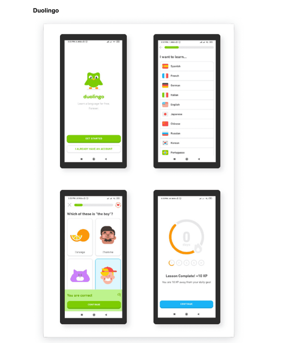
I kicked off my research by reviewing two companies playing within the instructional design space - IKEA and Duolingo. IKEA is a multinational company that designs and sells ready-to-assemble furniture, kitchen appliances, etc. They make furniture and appliances and send them to customers to assemble, with a 1-pager manual to guide them. This 1-pager manual usually contains a few sentences with images of the steps to assemble these products. Duolingo is a language learning app designed to simplify how people learn new languages. Duolingo app features more images, audio, video, and lesser texts, stimulating learners’ interest and reducing cognitive load. Multi-modal learning (engaging all human senses); Mastery (from practice); Imagery, Fewer texts, and more directions are highlights of the lessons from these brands.
In society, instructional design can play a role in informal learning through these key areas - cognitive learning, experiential learning, intentional mastery, and reducing cognitive load. Cognitive learning relies on five principles: understanding, remembering, applying, evaluating, and creating. Experiential learning is an engaged learning process whereby students “learn by doing” and by reflecting on the experience. Intentional Mastery focuses on students progressing to the next learning activity based on demonstrated mastery of the concept rather than on the schedule. Reducing cognitive load means simplicity, usage of different instructional techniques, and making learning 'bite-sized'.
These areas inform the design of Monipro. I presume that the target audience - millennials and Gen Zs will find this app useful and relevant to acquiring financial literacy skills. This target audience has the weakest attention span and needs to be motivated and their interest sustained at every point of learning.
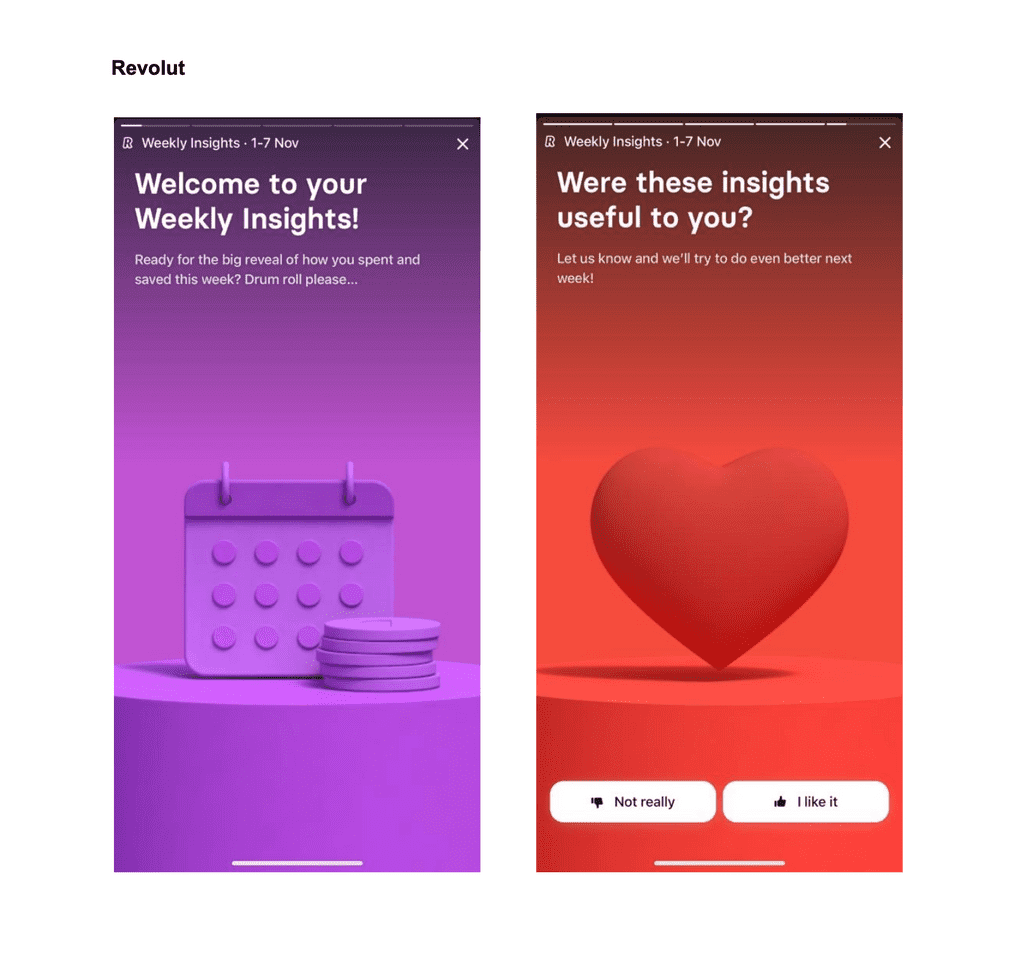
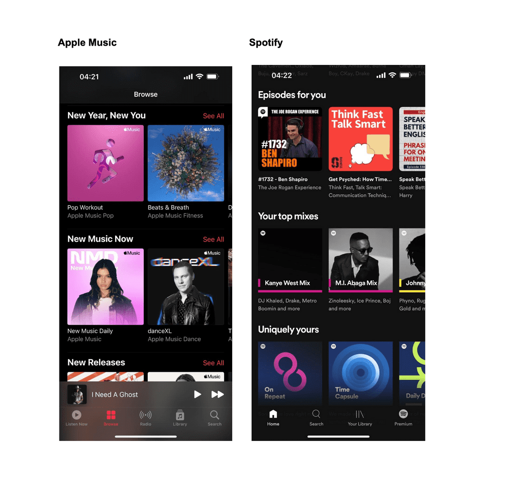
I sampled products like Duolingo, IKEA, Apple Music, Spotify, Revolut, and Google Meet. Duolingo and IKEA informed Monie’s instructional design approach to learning. Duolingo, in particular, informed the gamification process and reward structure of learning. Apple Music and Spotify informed how the user interface and app layout. These two music streaming apps are quite popular amongst millennials and Gen Zs. Taking a leaf from these apps meant putting out a product that users would find friendly and familiar. Revolut has a great onboarding process which is quite friendly as they employ the ‘Whatsapp status’ style of content presentation. The onboarding process and notification structure of Revolut informed how I shaped the onboarding process of the Monie app.
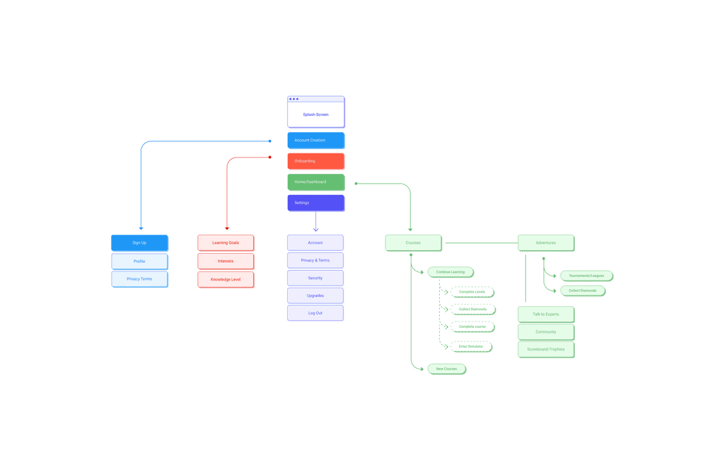
Information Architecture
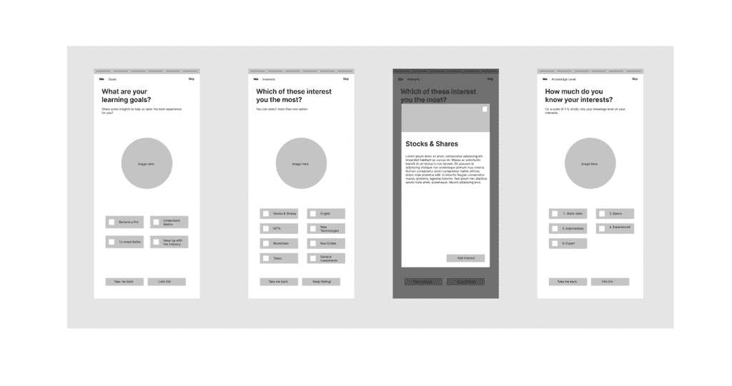
Low-Fidelity WireFrames
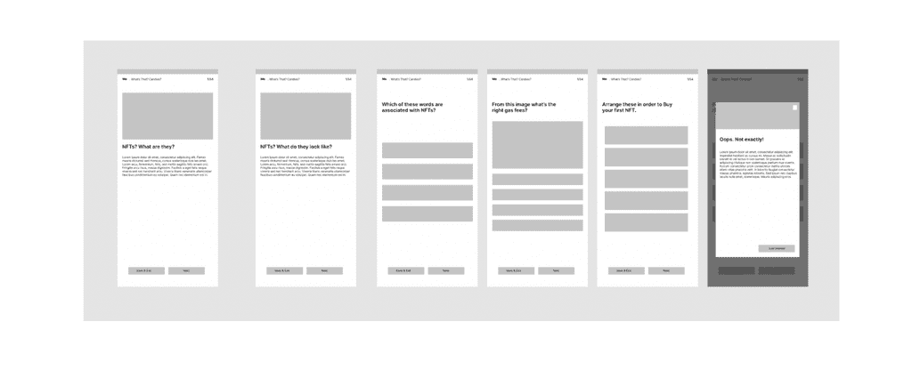
Hi-Fidelity WireFrames
Primary Onboarding
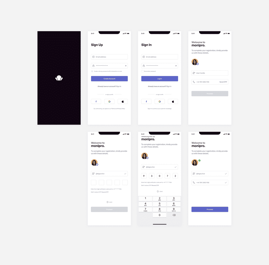
The primary onboarding comprises the basic account creation steps such as email, password, terms and privacy policy, and profile settings. This step is the first attempt to get a user into the app. After a user signs up, they are prompted to verify their account via OTP that will be sent to their devices. The final part of this was allowing users to add a profile picture and create a user tag. This user tag serves as a unique id/handle which they identify by learning leagues, profile sharing with friends, and other interesting activities.
Secondary Onboarding
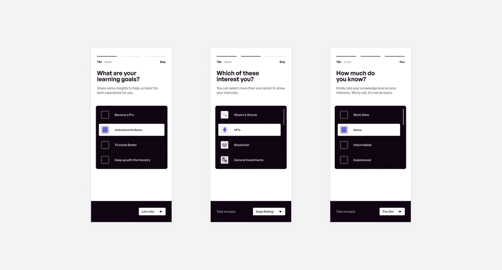
Through this step, Monipro learns the goals, interests, and levels of a user so as to tailor the content to suit their learning needs.
Dashboard and Learning
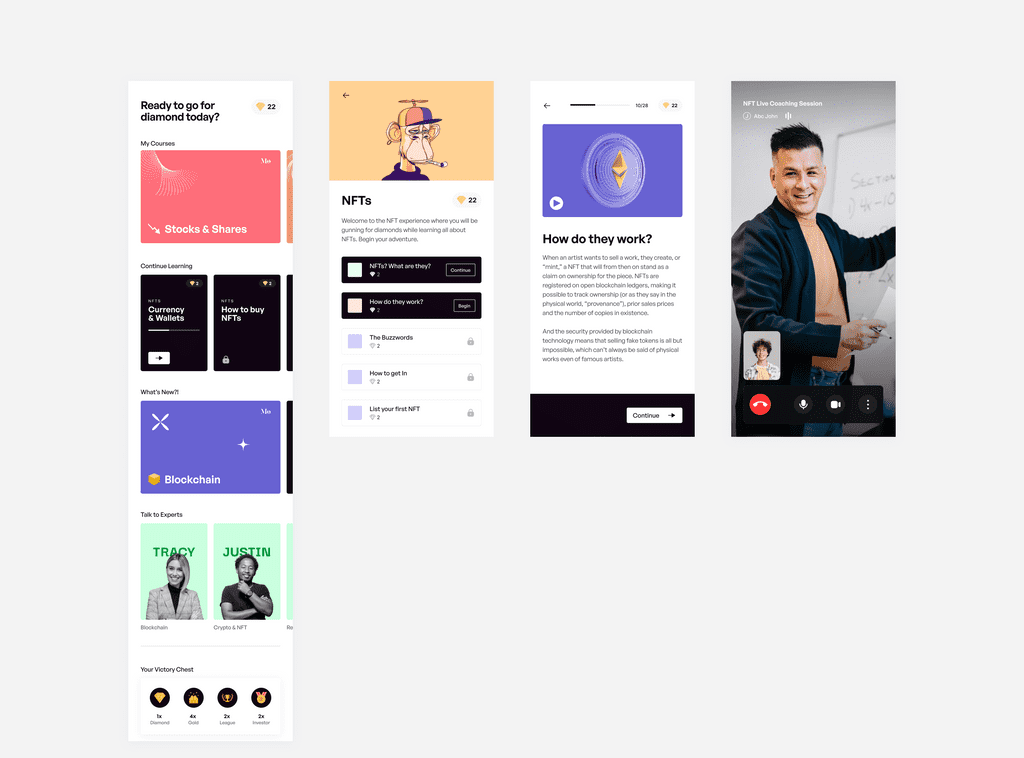
Learners can easily select from a list of courses to engage with. Each course features modules; bite-sized breakdowns of learning content on the segments of the course. In the modules are videos, images, and short write-ups explaining the learning content. At the end of each module, there is a quiz for each user to take. Learners can also book a call with an expert right in the app to get clarity on some questions they might have.
Gamification and Narratives
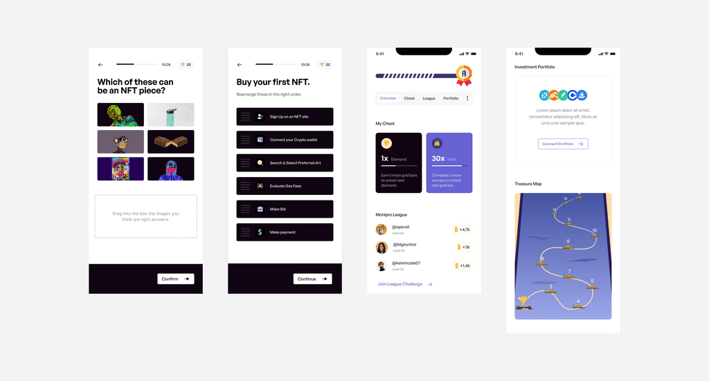
One of the interesting things about Monipro is how it makes learning fun and less demanding for learners. It features a gamified process in which users collect gems when they complete courses, participate in leagues or pass the course quizzes.
The app features a victory chest, monipro league, portfolio display, and treasure map.
The victory chest is a highlight of the key gems (gold and diamond) accumulated by a learner. Gold is collected as you complete levels in a course. 10 gold bars equal 1 diamond gem. You can use diamond gems to unlock courses when your subscription runs out. You can also pile up your diamonds and trade them in for Ethereum. Prospectively, 300 diamonds will equal 0.1 Eth.
The league is a weekly target of how many levels to unlock and quizzes to pass. The portfolio display is an optional feature where they can sync their investment portfolios and get tips on how to manage their investments. This portfolio display will be a future update.
The treasure map is a visual representation of a learner's journey to either earn a diamond gem or get Ethereum.
Finally, there is a scoring board ranging from A to E to show how a learner is performing. This scoreboard takes into consideration how many levels you’ve crossed in a course, how consistent your weekly learning is, and your performance in the quizzes.
This phase of the app is still undergoing product innovation to ensure loopholes are filled and a more solidified idea is put out.
Prototype
Interact with the limited prototype here
Video Production
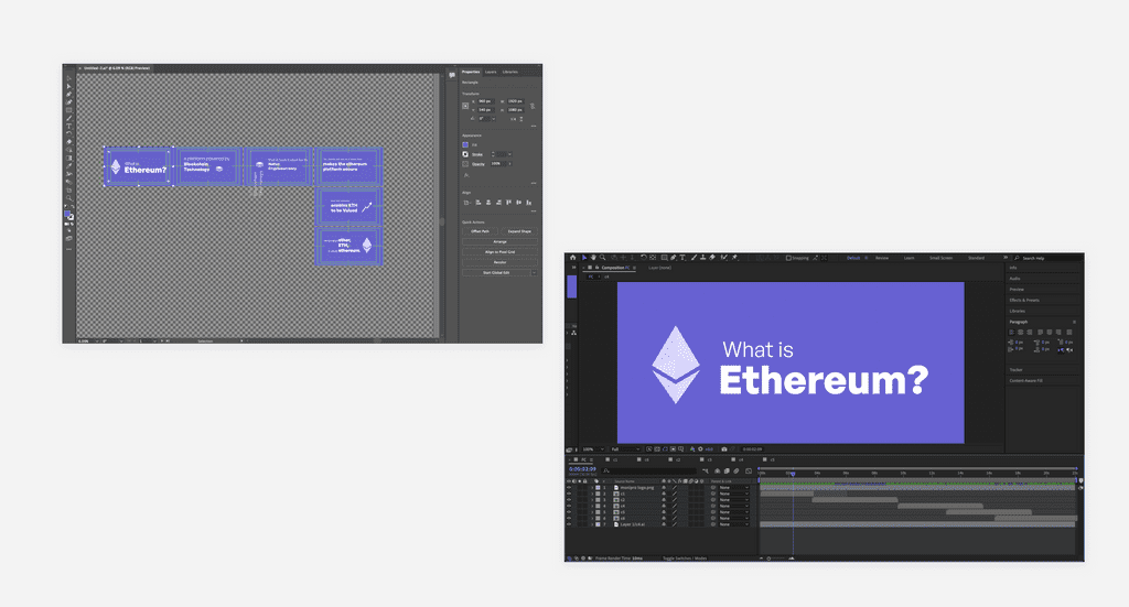
Monipro features custom videos to engage learners on the go. One of the videos features animated texts and 2d imagery. I created this video using two tools - Adobe Illustrator and Adobe After Effects. I first sketched the frames on paper and expectations for the animation and transitions. These frames guided the text content which I created in Notion. After creating the text/copy content for each frame shot, I started recreating the frame sketches in Adobe Illustrator. I exported the illustrator files to Adobe After Effects.
I worked on the text transitions and object animations for each frame in After Effects and also added audio effects to aid with the video assimilation as learners can watch videos on the go. Sound production was done in Adobe Audition by combining background music and voiceovers.
Play the video here
Web and App Development
The final stages were achieved using no-code tools Adalo and Webflow.
I built the landing page on Webflow. The live link is here.
I built the mobile app with Adalo. The app MVP is live for testing here.